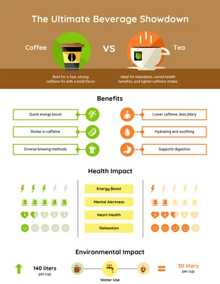
Payment Plan Comparison Infographic Template
Personalize this Payment Plan Comparison Infographic Template for a traditional plan comparison infographic and more
100% customizable templates
Millions of photos, icons, charts and graphics
AI-powered editing features
Effortlessly share, download, embed and publish
Easily generate QR codes for your designs
- Design stylemodern
- Colorsvibrant
- SizeLetter (11 x 8.5 in)
- File typePNG, PDF, PowerPoint
- Planbusiness
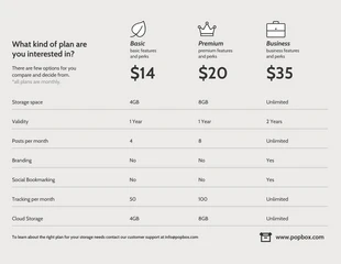
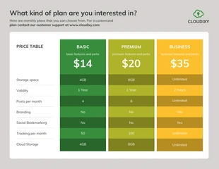
Develop a simple payment plan infographic with this customizable Payment Plan Comparison Infographic Template. You can easily edit the modern color palette, minimal font, and bold headings for a classic design. When it comes to comparing data like price plans, then opt for a modern color palette to keep the infographic more compelling. Make your own modern color palette or pick one of the automated modern color schemes on Venngage. You can then alter the color swatches and style or choose an entirely different color scheme. After you replace the text with your own, choose a minimal font so the content is clear to read. You'll find various minimal fonts available, but you can ultimately choose any font that works for you. Finish up the Payment Plan Comparison Infographic Template by applying bold headings so they jump off the page. People are naturally drawn to bold text and it's a great way to highlight key details. Have questions about the comparison infographic? Contact Venngage and we'll be glad to answer any questions!

