
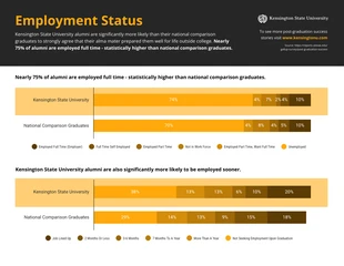
Alumni Employment Status Comparison Infographic Template
Create a dark employment status comparison and more by modifying this Alumni Employment Status Comparison Infographic Template

 100% customizable templates
 Millions of photos, icons, charts and graphics
 AI-powered editing features
 Effortlessly share, download, embed and publish
 Easily generate QR codes for your designs
- Design stylemodern
- Colorslight
- SizeLetter (11 x 8.5 in)
- File typePNG, PDF, PowerPoint
- Planpremium
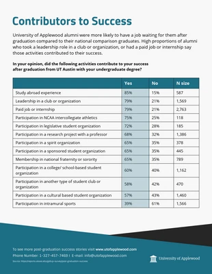
Make a vivid employment status comparison with this customizable Alumni Employment Status Comparison Infographic Template. The template features a graph, analogous color scheme, and shapes that you can modify in no time! Compare employment status by adding a graph to visually display your data. You can use a graph for each statistic and Venngage has an array of graphs, tables, and charts you can pick from. Make the Alumni Employment Status Comparison Infographic Template more noticeable by applying an analogous color scheme. Colors that shift through the color wheel are eye-catching and there are hundreds of automated color palettes on Venngage that you can utilize. You also have the ability to change an existing color scheme or to create your own. When it comes to data, make it easy to follow by incorporating shapes and designating them with a color. This way the reader can visualize the content and the information is easy for them to find. Begin editing the infographic today!
Related Infographic Templates
research infographics
health infographics
business infographics
comparison infographics
comparison infographics
university infographics
comparison infographics
comparison infographics
comparison infographics
school infographics
university infographics
comparison infographics