11 Aug 9+ Event Flyer Inspiration Examples & Templates – Daily Design Inspiration #4
Each day there are millions of pieces of content published on the internet. I mean, it’s overwhelming how much we can produce and share with the world in a 24 hour time period.
Especially in the design world.
That’s why I decided to put together this first edition of the Daily Design Inspiration. With this daily collection of flyer examples, I want to give new designers a platform to show off their work.
To spread some inspiration to readers. To collect amazing design work on one platform. And to make it easy for anyone to create something beautiful.
In this edition of the Daily Design Inspiration, we are going to look at some event flyer examples from Jamie Oliver Aspinall, Blake Allen, Rodrigo Sousa and a few from our own Venngage designers.
And if you want to learn how to make better flyers, check out this amazing article:

50+ Amazing Flyer Examples, Templates, and Design Tips
Also be sure to check out yesterday’s Daily Design Inspiration, we covered Education Infographics!
1. Hand Illustrated Event Flyer Example
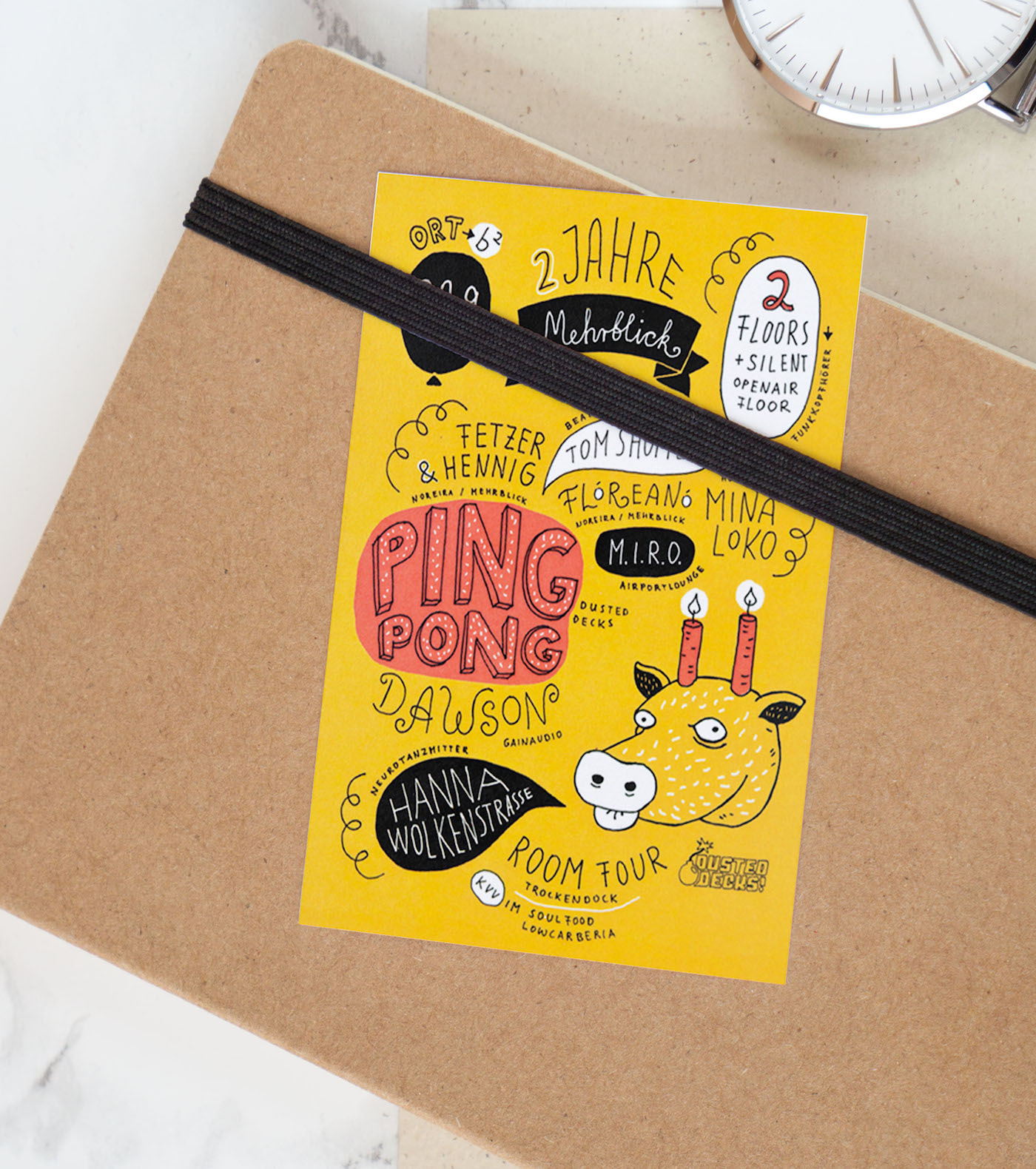
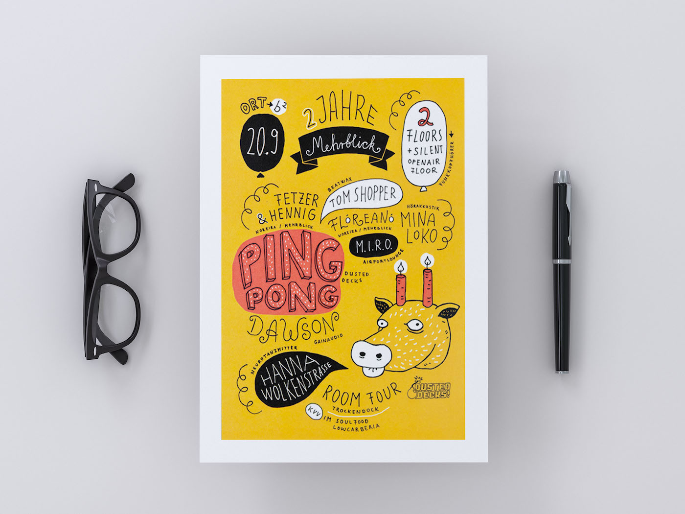
Creator: Alexandra Turban
Type: Illustrated Event Flyer Example Infographic
The yellow background in this event flyer design gives a happy, playful feel. While the black and pink background around certain elements helps identify key information for the event.
Alexandra Turban, the designer has chosen a handwritten font style for this event flyer design, giving it a more personal and genuine feel. The layout of each component gives a free feeling, the night can go any way you want it to; it doesn’t have to be a specific certain way. The font plays a very important role in incorporating a laidback theme, as compared to one more serious with structure. Shows how a font style can make or break your poster design.
The event flyer design is an example of how a similar style in each element can fit together to represent a theme, all part of a greater picture.
2. Prudential Ride London Non-Profit Event Flyer
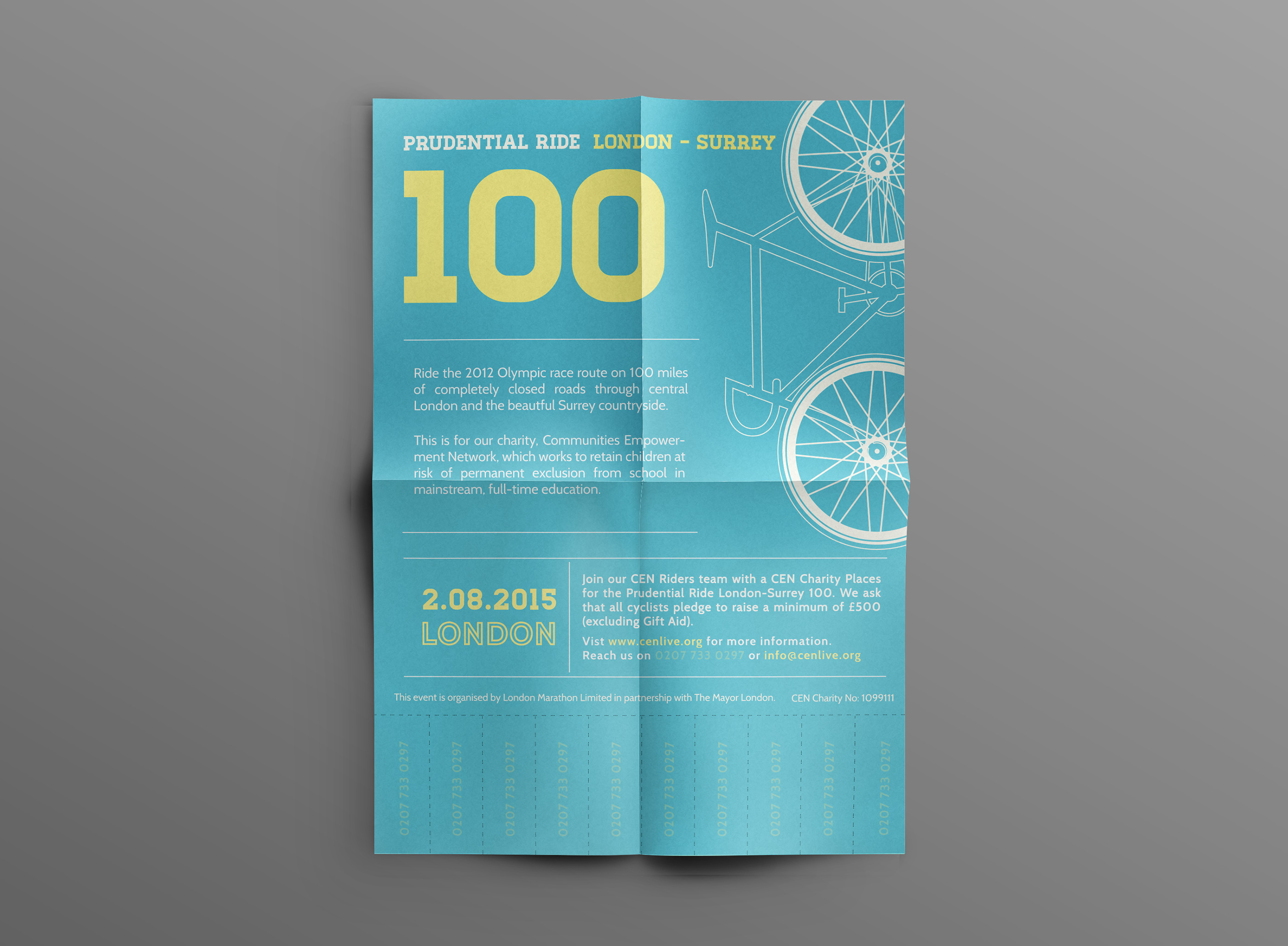
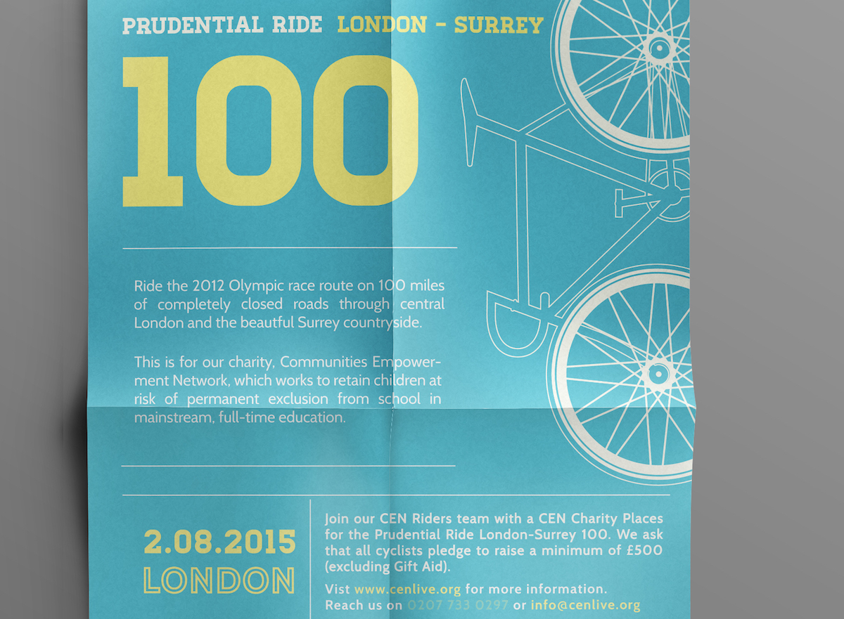
Creator: Sasha Ahuja
Type: Minimalist Non-Profit Event Flyer Example
The light blue background of this event flyer example gives a cool, refreshing vibe, just like you would feel with a Surrey countryside bike ride. The large illustration of the bike gives you an idea right away of what this event is about, without having to read through all the text.
Sasha Ahuja has broken down the flyer into multiple sections with the use of plain lines, making it easier to go through the information, in the correct path. The plain lines also give the event flyer example a clean and organized look.
When you have a great deal of information that needs to be remembered, a great hack is to create information strips that can be ripped and taken with the audience. Taking a piece of your flyer will initiate their call to action at a later time.
3. Get Out In The Green Now Event Flyer


Creator: Jamie Oliver Aspinall
Type: Minimalist Non-Profit Event Flyer Example
Lately, when I see any kind of flyer design inspirations, the text and illustrations play a significant role in the choice of color. However, this event flyer template is quite the opposite, making it unique from the rest. Instead, the words play a role in the type of illustration, and the colors don’t match what you would normally see. For example, there is nothing green in these poster designs, with the text, or the illustration of trees.
The more I look at this event flyer inspiration, the more intrigued I am. We are so used to seeing things a certain way, that when something out of the norm happens we don’t know how to react at first. This can be a very effective technique to apply to your event poster designs as it will not only suck the reader in but also make them appreciate it even more.
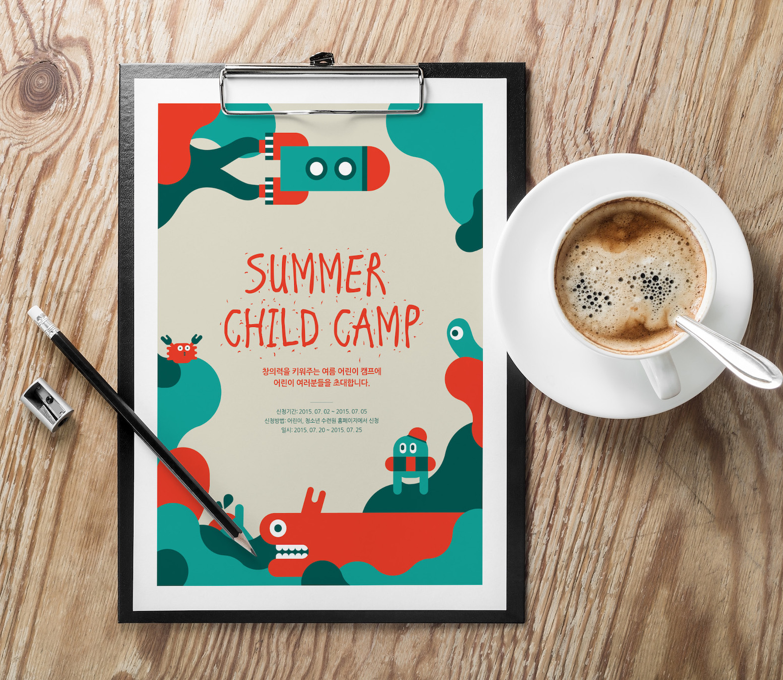
4. Futuristic Science Fair Event Flyer Example
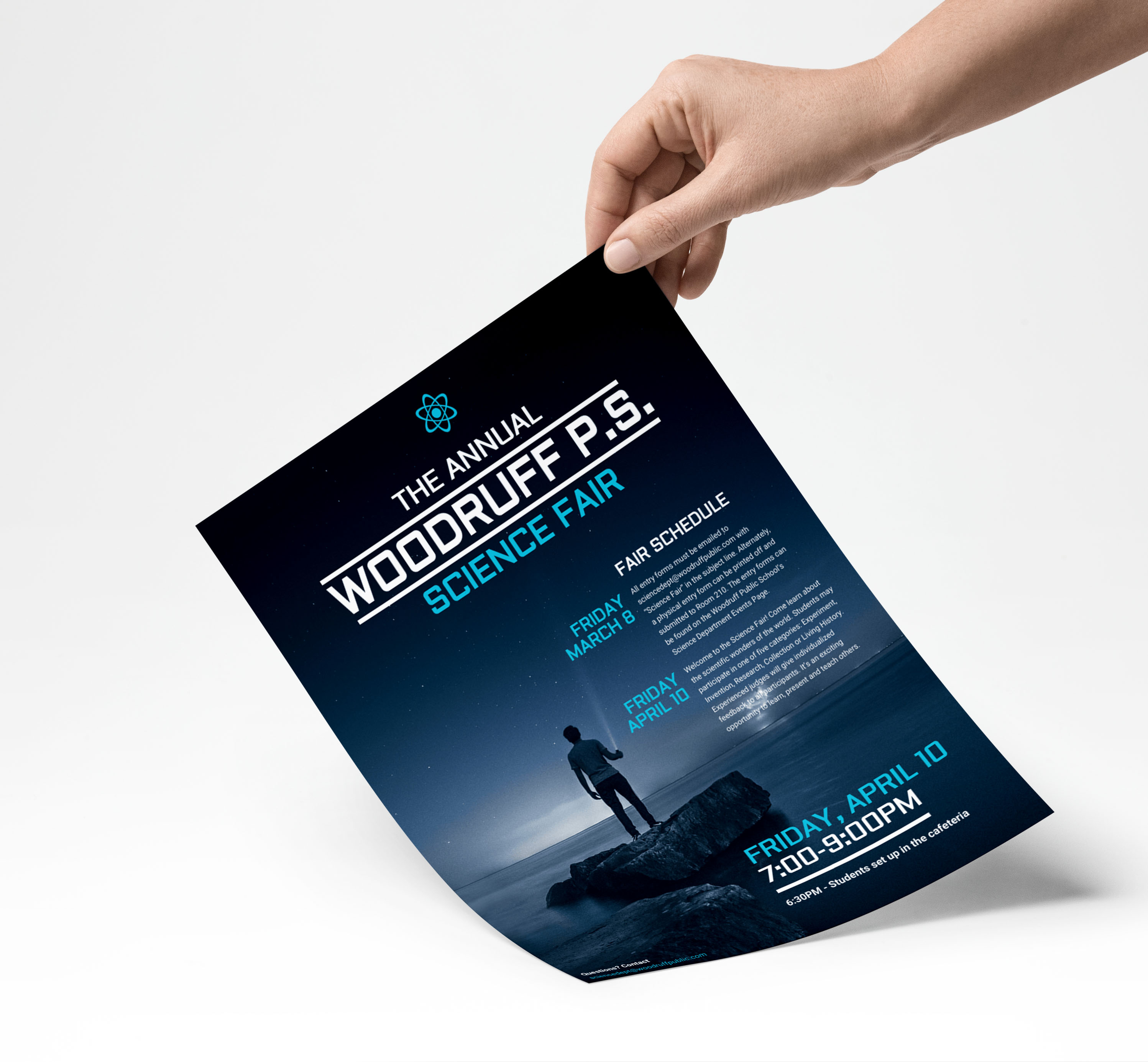
Creator: Venngage
Type: Educational Event Flyer Example
Recently the futuristic concept is becoming more popular than ever, so why not reflect it in your event flyer example? In this case, the theme fits right in; science is all about new innovations for a better tomorrow.
The easy to read font style and colors against this background image will instantly attract kids when they see this. Using a color that kids enjoy is essential when catering to their market. You want to keep it as clear as possible so they can easily remember the details because they enjoyed the design. The event flyer example above has a maximum of two different font styles and colors used, which helps avoid any confusion while keeping the reader focused. The more you use in your design, the more you open yourself up to distractions with the audience.
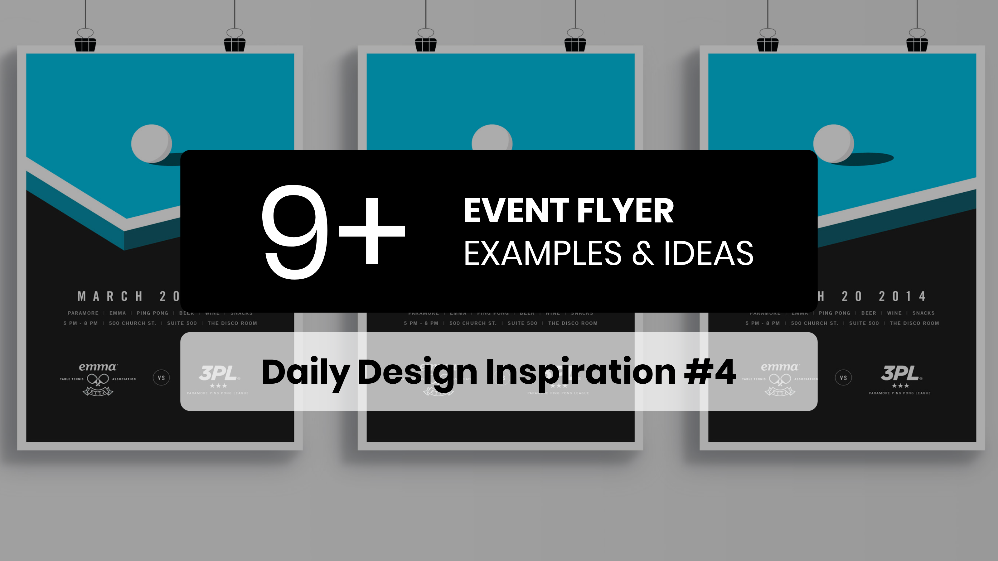
5. Minimalist Ping Pong Event Flyer Example
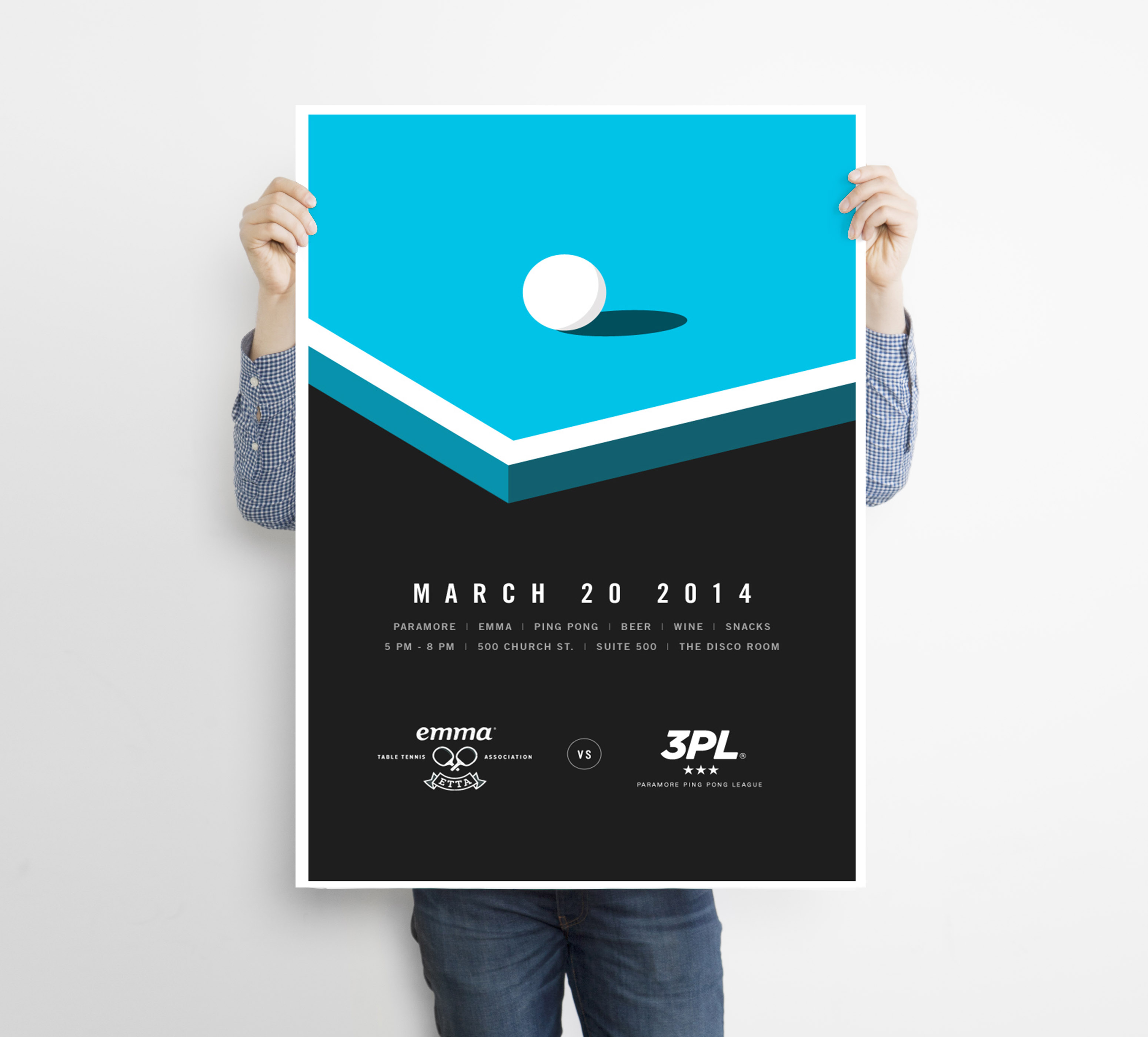
Creator: Blake Allen
Type: Educational Event Flyer Example
One thing I enjoy the most is simple, and powerful designs, just like this minimalist event flyer. Blake Allen, the designer, catches your eye instantly by using simple flat shapes with bold text. This shows you don’t need complex designs at all in order to be effective.
The different shades of color on the Ping-Pong table creates a shadow, and depth in this flat lay poster design. No matter how far you are from this minimalist event flyer, you can spot it and automatically come in for a closer look. I mean I don’t even play Ping-Pong, but the design makes me want to attend!
The white text against the black solid background makes it easy to read and also stands out more next to the white in the Ping-Pong table and the margin. This shows you can use the same color in different areas, to help make it pop.
6. Bold Typography Office Event Flyer
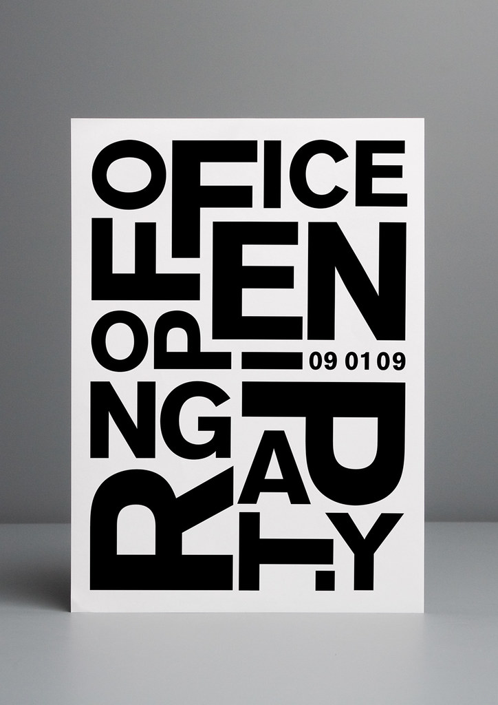

Creator: David Corti
Type: Typographic Event Flyer Example
The alignment of each letter makes you stop in your tracks to figure out the words properly, just like a puzzle! The designer didn’t make it easy for the reader to comprehend in a single second and move on. Instead, you have to stop and stare for a while, and the longer you stay the more you appreciate it. A Job Well Done for David Corti!
Each letter in this event poster design is different from the next, but all are respectful in spacing to one another and to the margin itself. Consistent spacing across the page can really help give a clean organized look, no matter how busy the page is. Another effective aspect is the sense of balance, with the title requiring work to be deciphered, the date of the event is clear and easy to find, making it memorable.
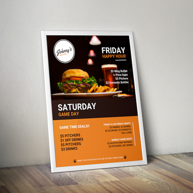
7. Blue & Yellow Business Conference Event Flyer
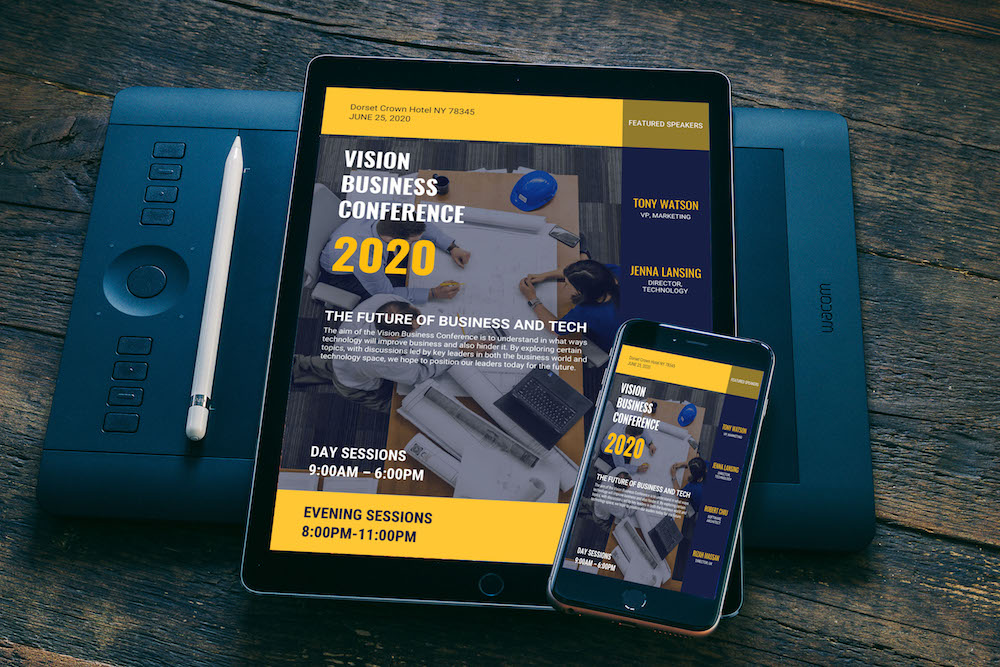
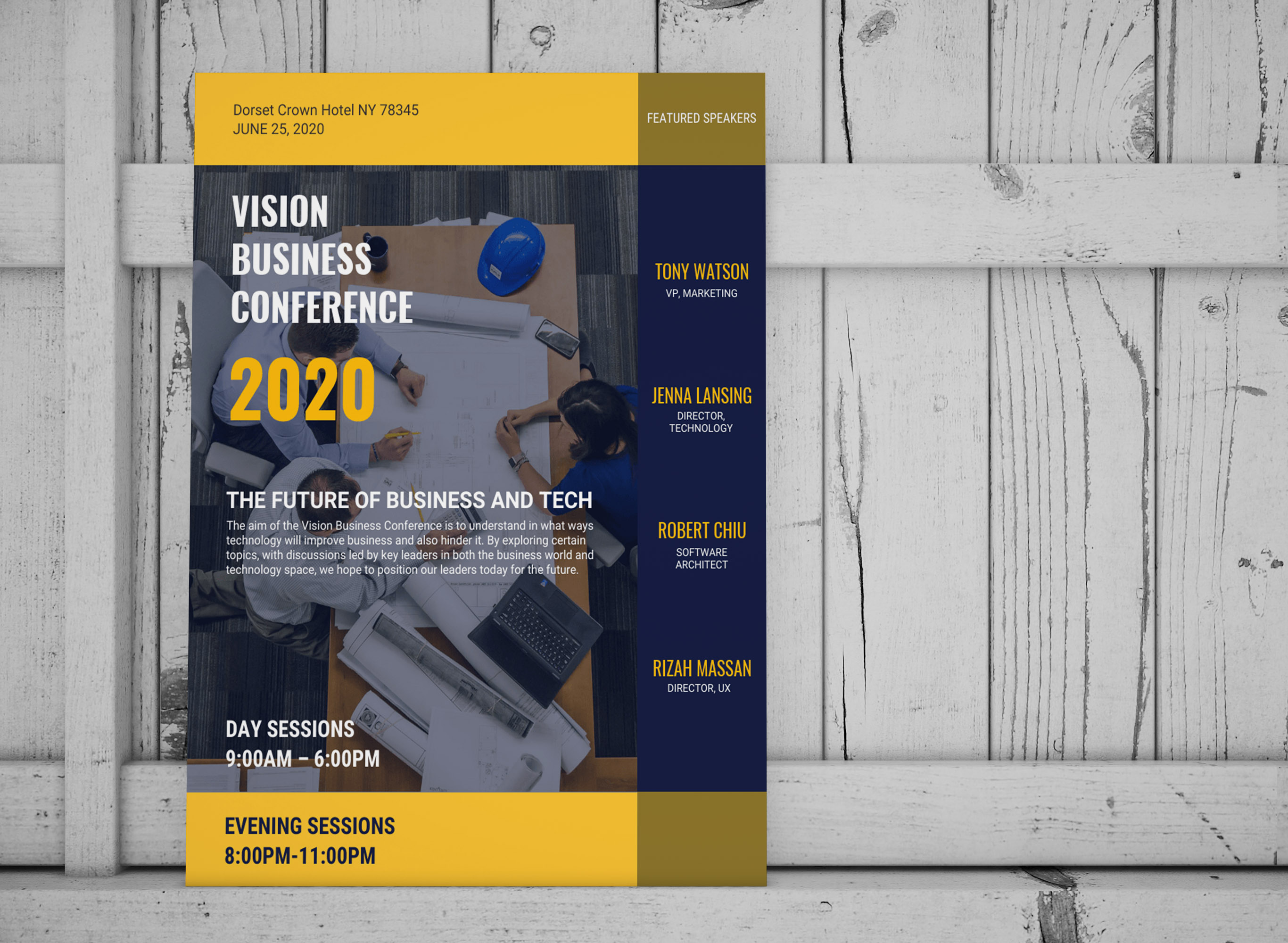
Creator: Venngage
Type: Photo-Centric Business Event Flyer
When we see an image in a poster design, we tend to automatically place our focus on it. However, this was not the case with this business event flyer, all thanks to the subtle color overlay used to soften the image.
With business event flyers, it’s important to remember key information, and with this layout, it’s very easy to scan the page and retrieve it. The use of panels across the page helps keep the information organized and balanced. While the use of color makes important details stand out from the rest. When creating business event flyers, you can use a variety of colors, font style and font weight to place emphasis on key details.
8. Gradient Heavy Demo Day Event Flyer
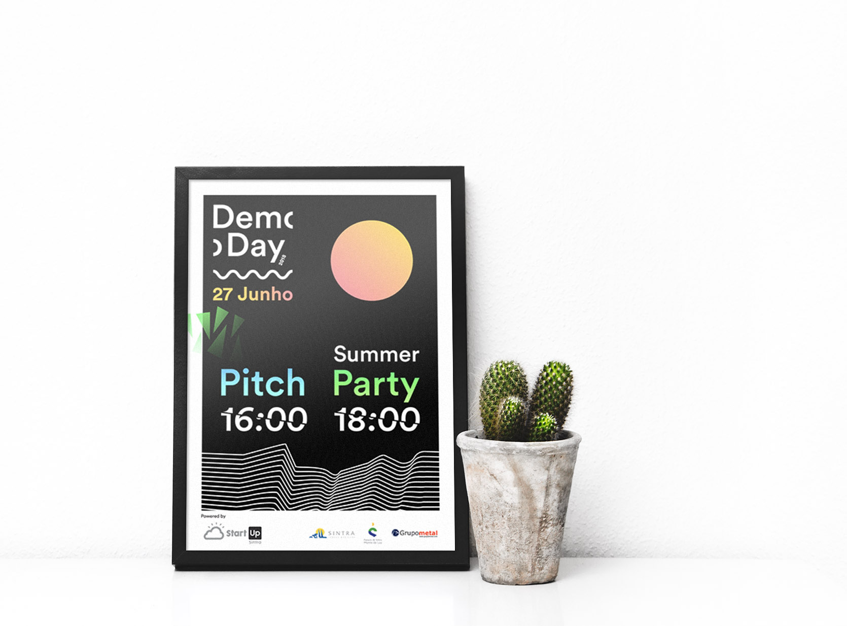
Creator: Rodrigo Sousa
Type: Gradient Business Event Flyer
When I think of gradients, I always associate them to the way they were used in the ’90s, but lately, they are making a comeback and in a subtler manner. The gradient in this event flyer design is very soft and pleasing to the eye, creating a fresh summer vibe.
Instead of using shapes and text with solid colors, if you had a gradient to it, you can bring a whole different feel. Just by looking at the gradients used, I can tell the event will last through the day, possibly around sunset. Such details would not exist has only solid colors been used, instead, the reader would have to rely solely on reading the text.
9. Simple Transparent Concert Event Flyer Example
![]()
![]()
Creator: Unheard Film Festival
Type: Transparent Concert Flyer Example
The sound waves in this event flyer design correlate to the word “Unheard” in the title itself. It could even relate to the fact that at one point in time, a woman’s voice was unheard, and now this film festival will promote quite the opposite.
I personally love it when each element on the page goes hand in hand with what the theme is about, it shows a well thought out event flyer design.
In order to mute the background image in a subtle way, a color overlay has been placed on top. This creates layers and depth, while at the same time a clear canvas for the information to be presented on. This allows the reader to sift through the information without having to look too hard.
You made it to the end! Now if you want to learn more about creating flyers, start with these articles:
35+ Highly Shareable Product Flyer Templates & Tips
50+ Amazing Flyer Examples, Templates, and Design Tips
Or check out yesterday’s Daily Design Inspiration here: