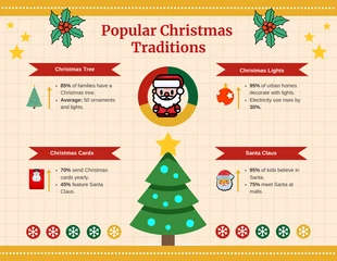
Clean Minimalist Infographic Template
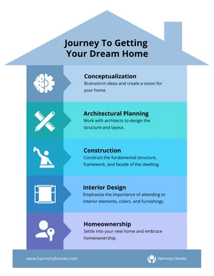
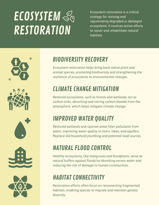
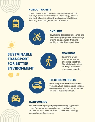
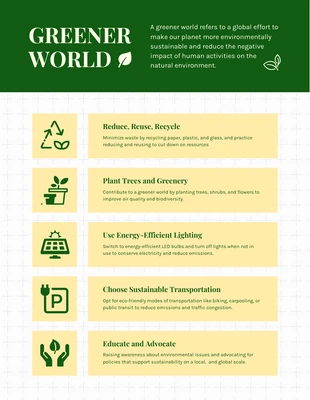
Present information neatly and concisely to explain a short process or data from research. Customize this minimalist infographic today.
100% customizable templates
Millions of photos, icons, charts and graphics
AI-powered editing features
Effortlessly share, download, embed and publish
Easily generate QR codes for your designs
- Design stylemodern
- Colorslight
- SizeLetter (11 x 8.5 in)
- File typePNG, PDF, PowerPoint
- Planfree
A minimalist infographic is a clean and straightforward way to present information. It is an excellent example of effectively communicating data in an unfussy way, often used to deliver information clearly and concisely. It is utilized for various purposes, such as explaining a complex concept, showing data from research, or simply providing an overview of information. Simple shapes and colors keep the design uncluttered and easy to understand in a minimalist infographic. At the same time, the limited text ensures that the viewer can quickly grasp the key points. It uses negative space, neat lines, and simple graphics to convey information effectively. It allows you to focus on the critical message you want to communicate without getting distracted by unnecessary details. White space gives the text breathing room, helping make the infographic easier to read. Keeping the design and layout neat and spartan when using a minimalist infographic is essential. Because of its simplicity, it can be easily comprehended by a general audience. Creating a minimalist infographic can be challenging if you build one from the ground up. But the process

