
Human Resource Management Arrow Infographic Template
How to use an arrow infographic for complex data visualization

 100% customizable templates
 Millions of photos, icons, charts and graphics
 AI-powered editing features
 Effortlessly share, download, embed and publish
 Easily generate QR codes for your designs
- Design stylemodern
- Colorslight
- SizeLetter (11 x 8.5 in)
- File typePNG, PDF, PowerPoint
- Planbusiness
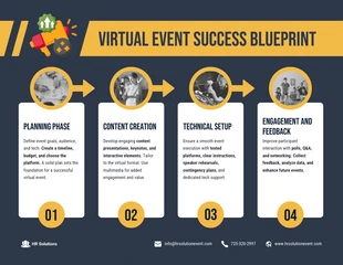
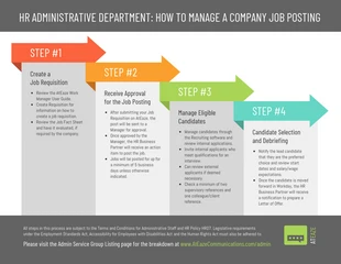
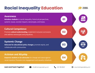
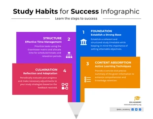
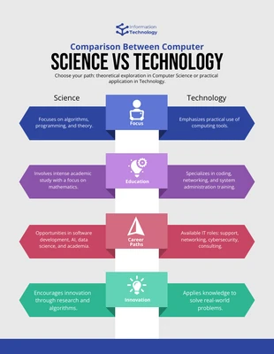
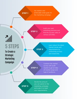
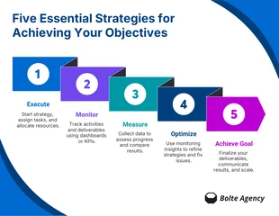
An arrow infographic is a type of infographic that uses arrows to visually represent information or data. They are often used to show steps in a process, relationships between different elements, or progress over time. They are a great way to make complex data easy to understand, and can be used to show relationships between different concepts or ideas. Arrow infographics can be used to make complex information easier to understand, and they can also be used to add visual interest to a presentation or website. If you're looking for a creative way to represent data or communicate a message, an arrow infographic may be the perfect solution. They can be used to highlight a cause and effect relationship, to show how something works, or simply to list a series of steps in a process. When used correctly, arrow infographics can be an effective way to communicate complex information in a simple and visually appealing way. However, because they often rely heavily on graphics, they can be difficult to create without the help of a professional designer. When designing an arrow infographic,
Related Infographic Templates

house infographics

cartoon infographics
event infographics
process infographics
education infographics
education infographics
computer infographics
math infographics
timeline infographics
marketing infographics
list infographics

cloud infographics