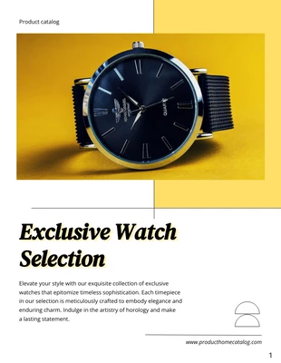
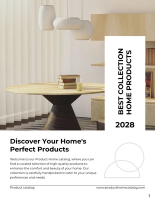
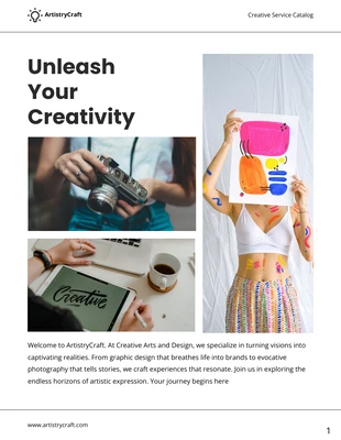
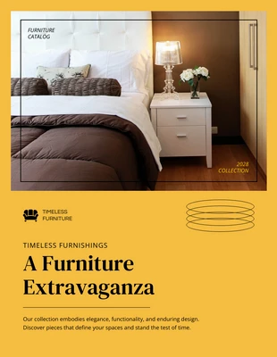
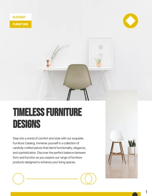
Best Watch Collection Product Catalog Template
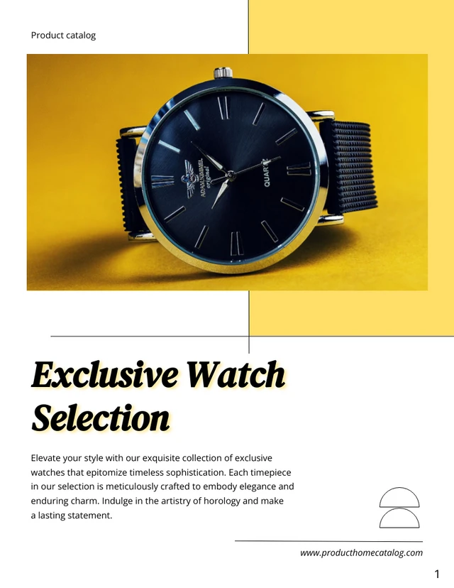
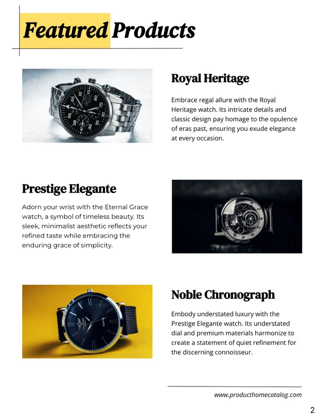
Unleash your creativity! Design your ideal watch with our Yellow Pastel Minimalist template.
100% customizable templates
Millions of photos, icons, charts and graphics
AI-powered editing features
Effortlessly share, download, embed and publish
Easily generate QR codes for your designs
- Design stylemodern
- Colorslight
- SizeLetter (8.5 x 11 in)
- File typePNG, PDF, PowerPoint
- Planbusiness
Accentuate your promotional campaign with our Yellow Pastel Minimalist Best Watch Product Catalog Template. This design is the perfect foundation for getting your message out there and showcasing your top-notch timepieces! Easily customizable, you can tailor it to mirror your brand's unique identity. Modify colors, resize elements, or choose from our vast selection of free photos and icons. Craft your catalog to perfection using Venngage, turning your vision into a tangible design. Let this template elevate your campaign, catching eyes with its attractive minimalist design framed in calming pastel yellow. It’s more than a template - it’s a tool to bring your ideal designs to life.
Explore more
- Minimalist
- Pastel
- Product
- Promotion
- Yellow
