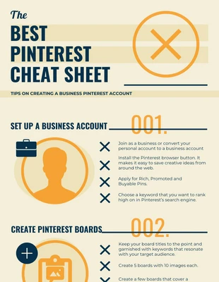
Don’t struggle to come up with social media infographics from scratch! Creating an infographic will be a breeze once you use the design tips featured in this infographic example! This Pinterest infographic was created by Venngage and has simple designs anyone can pick up.
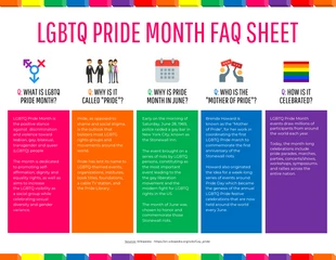
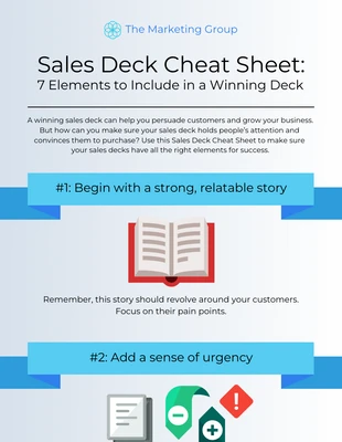
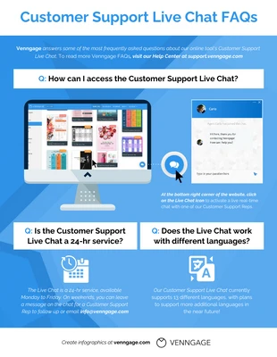
Even though it’s simple, it’s still eye-catching by using icons. Try adding icons that fit the topic and are various sizes to keep the reader focused.
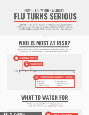
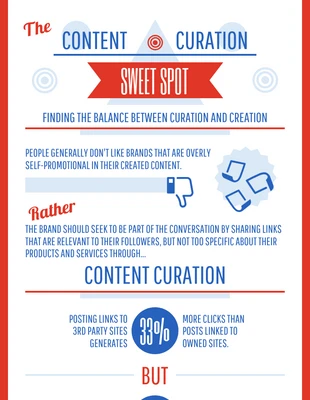
If you have lots of content break it up into sections divided by lines and add lists for multiple items or steps. Not only does it give the marketing infographic a unique layout but it also makes it easy to follow. The last thing you want is to clump large amounts of text together because most people won’t continue reading it.
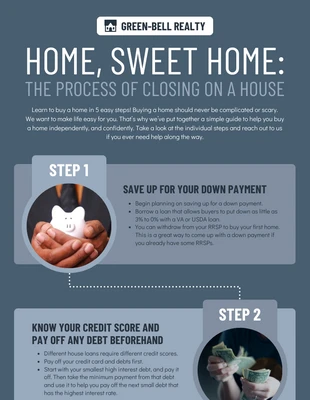
Depending on the subject of your list infographic, you’ll want a color scheme that works with the theme. For this social media infographic, the designer went with a professional color palette. The colors aren’t too bold or bright and have just the right amount of subtlety to emphasize the text and icons.
You can also use a modern font and bold headings to make the text really pop off the page. Design social media infographics that are effective and interesting with these simple tips and tricks!
Coming up with a great design idea from scratch is hard work! That’s why we have collected over 1000 examples of infographics, flyers, brochures, posters and more, to inspire designers of all skill levels.