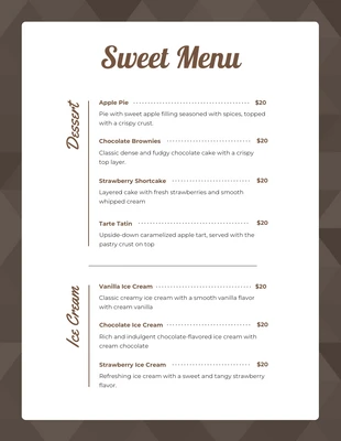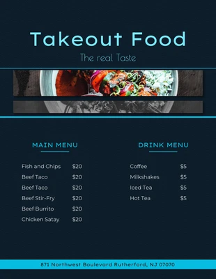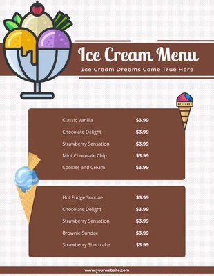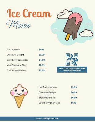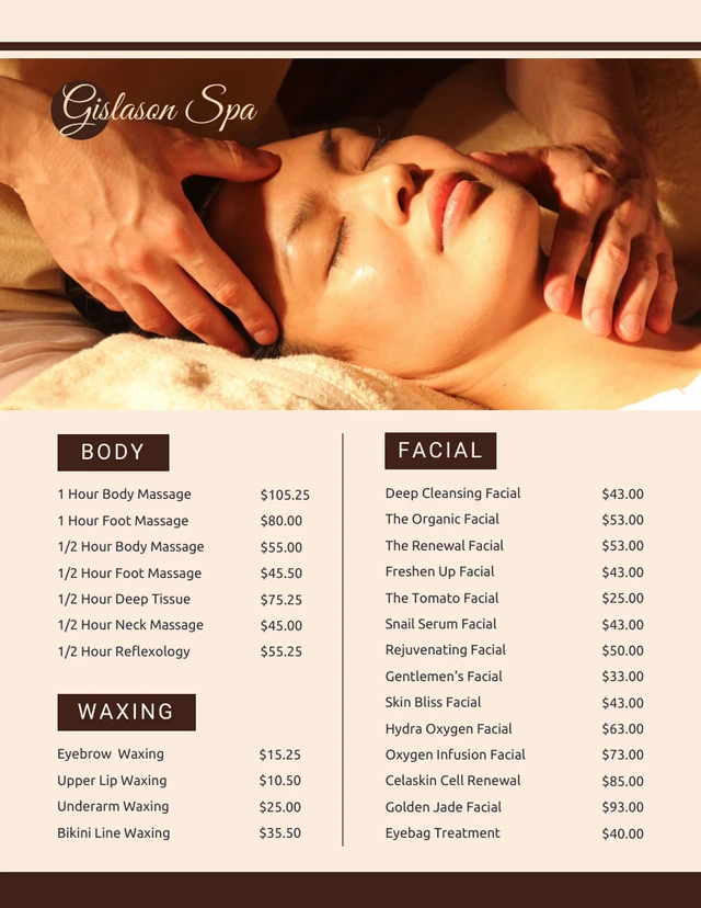
Cream Minimalist Spa Menu
Unleash your creativity by designing a unique, refreshing and appealing Spa Menu with our minimalist template!
100% customizable templates
Millions of photos, icons, charts and graphics
AI-powered editing features
Effortlessly share, download, embed and publish
Easily generate QR codes for your designs
- SizeLetter (8.5 x 11 in)
- File typePNG, PDF, PowerPoint
- Planfree
Looking for a way to revamp your Spa Menu? Our Cream Minimalist Spa Menu Template is the perfect blend of elegance and simplicity. This design is sure to entice prospective clients with its easy-to-read typography and soothing cream color palette. But it's not just about aesthetics - this versatile template is a superb tool for promoting your services. It can easily be customized, allowing you to adjust colors, resize text and select the perfect photos or icons from our extensive free stock libraries. With Venngage, you're only a few clicks away from creating a spa menu that truly reflects the essence of relaxation and luxury, getting the word out about your amazing treatments. Dive in now and design with ease!
Explore more
- Facial
