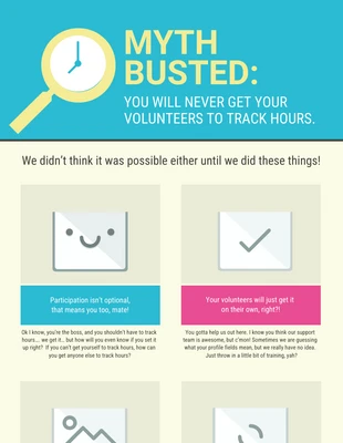
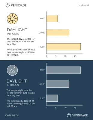
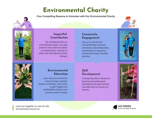
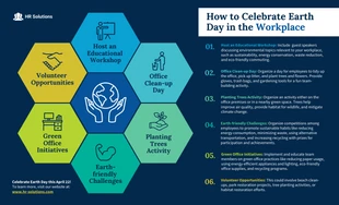
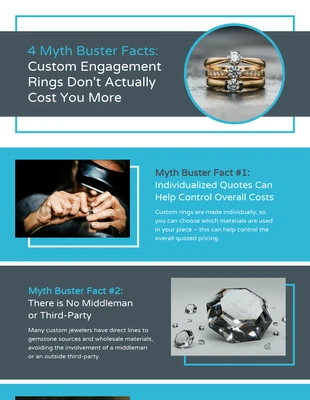
People still believe in old myths but now you can set them straight with the true facts when you customize your own list infographic! Check out the simplicity of this myths infographic from Venngage! You can integrate the same techniques in any of your infographic ideas. Instead of making a long bullet list of facts, try breaking them up in columns.
In this infographic example, the designer chose to use three columns and sections of three facts. Separating them and adding a border in between gives this layout a nice flow. Another way to captivate your audience is by using images for each mystery you’re discussing.
Human eyes are naturally drawn to graphic images, so a visual infographic is a perfect choice. The designer added these images to their own boxes and highlighted the titles in a text box with dotted lines. This template features a natural color palette that compliments the images and doesn’t distract from the content.
You can also make each old myth pop off the page by making them bold and in a larger size. It will immediately catch someone’s eye and keep them focused on reading more. The use of a modern font adds to the template and makes it easy to read which is important for keeping people on your page. Create more unique list infographic templates with these basic design methods.
#EEE070
#E6F8F5
#FBC1C1
1280 x 6244px
MyOffers
Coming up with a great design idea from scratch is hard work! That’s why we have collected over 1000 infographic, flyer, brochure, poster and more examples in the Venngage Gallery to help inspire each and every designer.
Coming up with a great design idea from scratch is hard work! That’s why we have collected over 1000 examples of infographics, flyers, brochures, posters and more, to inspire designers of all skill levels.