
Pie Chart PowerPoint Presentation Template
Highlight essential information and make your data presentation visually appealing by customizing this pie chart PowerPoint template.

 100% customizable templates
 Millions of photos, icons, charts and graphics
 AI-powered editing features
 Effortlessly share, download, embed and publish
 Easily generate QR codes for your designs
- Design stylemodern
- Colorsdark
- SizeCustom (1024 x 576 px)
- File typePNG, PDF, PowerPoint
- Planpremium
A pie chart is a graphical representation of data that uses slices to show relative proportions. It is often used to illustrate numerical data, especially percentages of a whole. The area of each portion is proportional to the quantity it represents. A great way to present data in an easy-to-understand manner is a pie chart PowerPoint. You can customize it to highlight the most critical information and make the data visually appealing. The chart can also be used to show trends over time or to compare different data sets. Pie charts are a popular choice for presentations because they are easy to create and interpret. However, they have some disadvantages. Comparing data sets with different numbers of slices can be challenging. In addition, the way the pieces are arranged can create optical illusions that make the data appear to be other than it is. Despite these drawbacks, pie charts remain a presentation mainstay and can be a valuable tool for conveying information. When used correctly, they can effectively communicate complex data sets. When creating a pie chart PowerPoint, it is important to use colors
Related Presentation Templates
 1/5
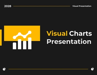
1/5visual chart presentations
 1/6
1/6visual chart presentations
 1/5
1/5visual chart presentations
 1/5
1/5human resources presentations
 1/5
1/5marketing presentations
 1/5
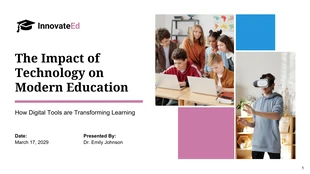
1/5education presentations
 1/5
1/5business presentations
 1/5
1/5research presentations
 1/5
1/5visual chart presentations
 1/5
1/5visual chart presentations
 1/5
1/5health presentations
 1/18
1/18finances presentations