
Time Infographic Template
Promote microlearning with engaging visuals and easy-to-understand explanations of complicated concepts using this time infographic.

 100% customizable templates
 Millions of photos, icons, charts and graphics
 AI-powered editing features
 Effortlessly share, download, embed and publish
 Easily generate QR codes for your designs
- Design stylemodern
- Colorslight
- SizeLetter (8.5 x 11 in)
- File typePNG, PDF, PowerPoint
- Planbusiness
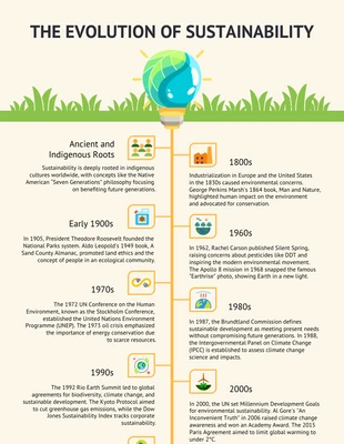
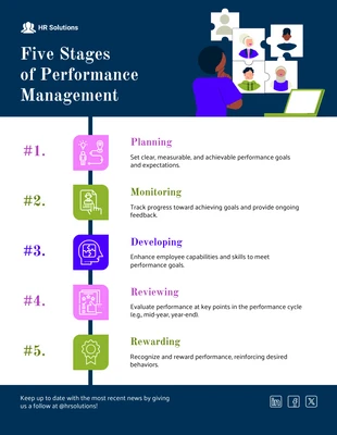
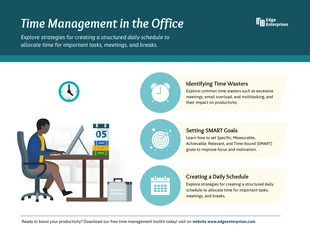
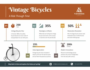
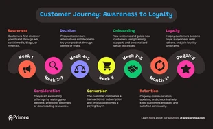
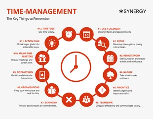
A time infographic represents data showing how a particular process or activity progresses. You can use it to illustrate changes in anything from the weather to the stock market. It is an essential tool for understanding complex data sets. Businesses and companies use time infographics to track progress and performance. News organizations use them to report current events. You can also employ them for more light-hearted purposes, such as illustrating the history of things or showcasing exciting facts about process improvements. It typically uses a clock face showing how data has changed over a period. It may also include other elements such as maps, images, and text to provide context and additional information. A time infographic can be static or interactive and is often shared online through social media or email. In customizing a time infographic, there are a few things to remember. First, decide what data you want to present and how you want to portray it. Gather information related to your chosen theme or focus. You can research online, talk to experts, or visit museums. Organize your data and information
Related Infographic Templates
fitness infographics
timeline infographics
timeline infographics
timeline infographics
timeline infographics
office infographics
vintage infographics
timeline infographics
list infographics

cooking infographics
research infographics
timeline infographics