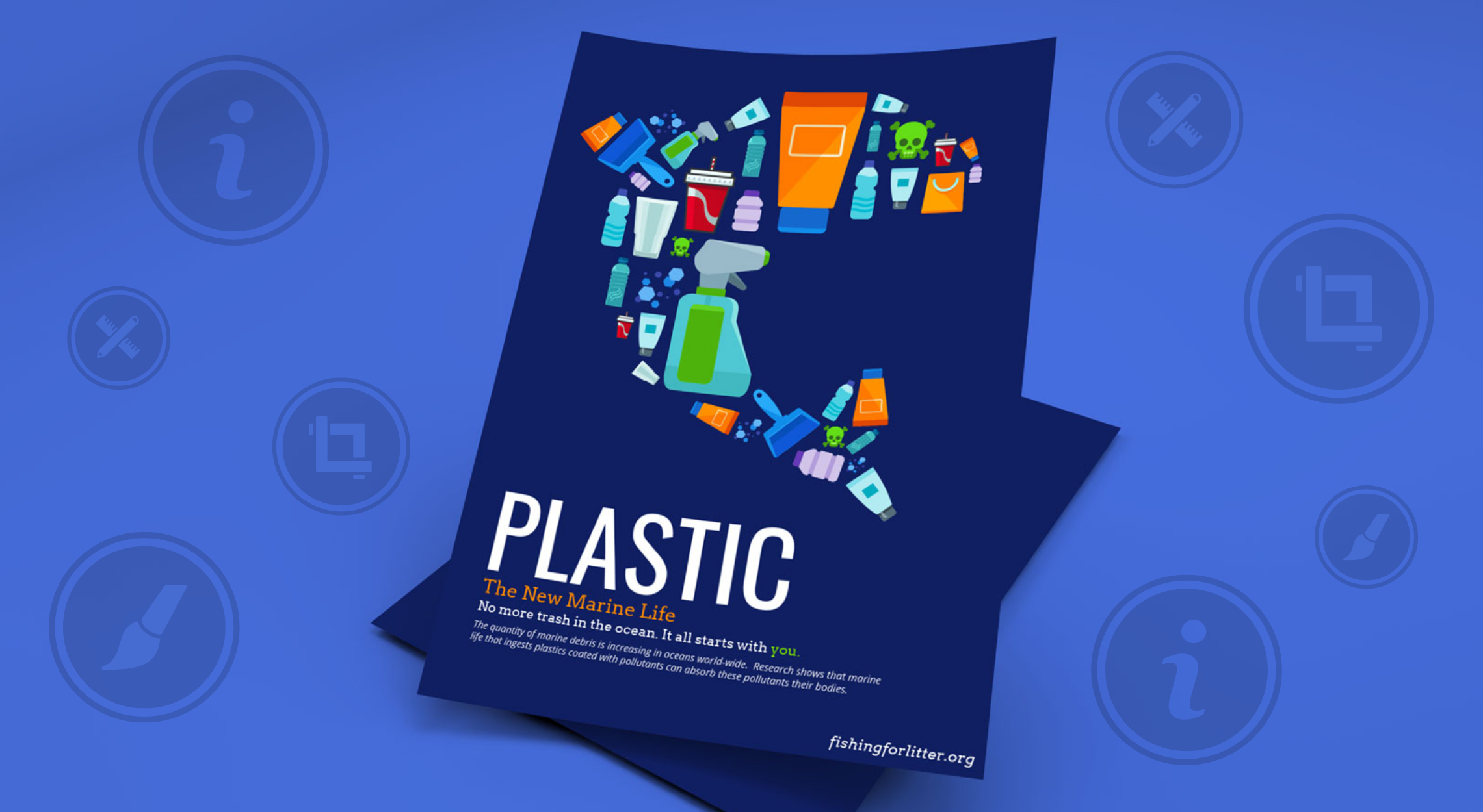
Festival Nrmal Event Poster Design

There’s a ton of information contained on this poster, but yet it doesn’t feel messy or overwhelming. And if you were not aware, concert posters can quickly devolve into madness when more than a handful of artists are performing.
But this example avoided that trap exceptionally well. I would guess that the plethora of white space and bold font helped make the info easy to consume.
Additionally, I really like the use of masking tape to bring attention to the important details like date and location!
Be sure to check out this event poster example in our Daily Design Inspiration #12!
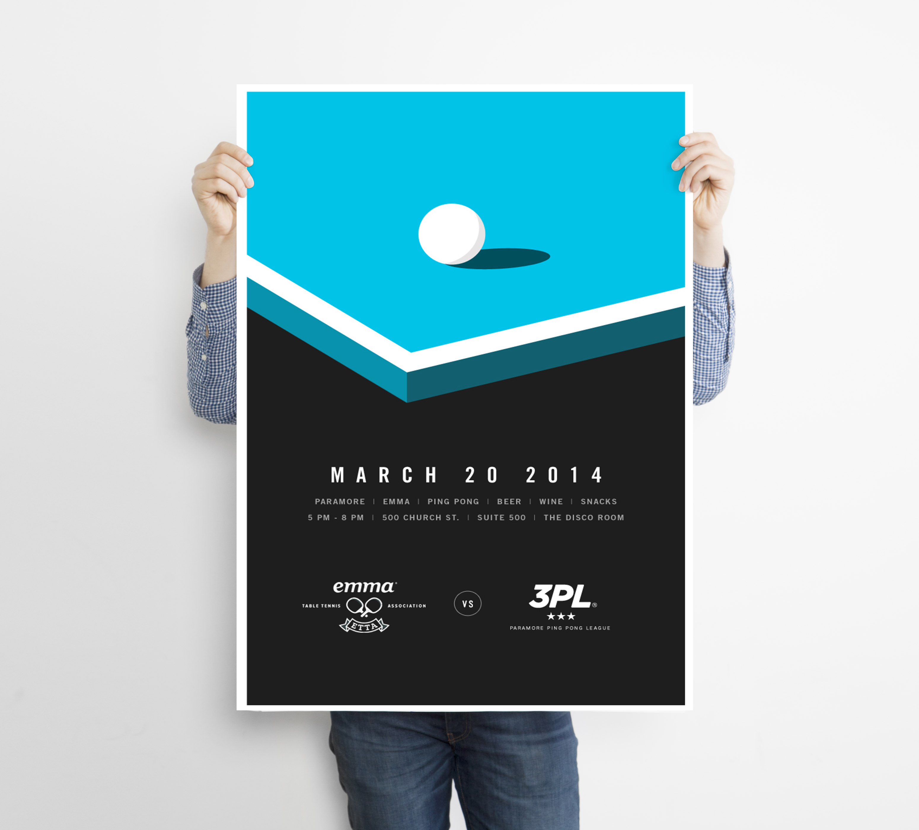
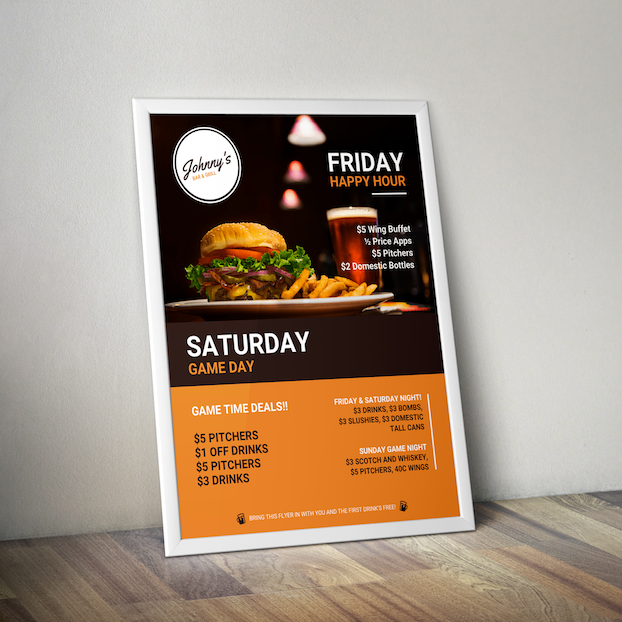
Poster Features
- Multiple Gradients
- Bold Font
- Creative Colors
- Strong Background Image
- Innovative Design
- Modern Font
- Creative Poster Design
- Business Poster Design
- Modern Poster Design
Learn More About Posters

Category
Business Poster Examples, Creative Poster Examples, Event Poster Examples, Marketing Poster Examples, Poster ExamplesComing up with a great design idea from scratch is hard work! That’s why we have collected over 1000 examples of infographics, flyers, brochures, posters and more, to inspire designers of all skill levels.