12+ Creative Resume Examples, Templates & Ideas – Daily Design Inspiration #28
34043
post-template-default,single,single-post,postid-34043,single-format-standard,ajax_fade,page_not_loaded,,hide_top_bar_on_mobile_header,transparent_content,qode-theme-ver-9.5,wpb-js-composer js-comp-ver-4.12,vc_responsive

12+ Creative Resume Examples, Templates & Ideas – Daily Design Inspiration #28

12+ Creative Resume Examples, Templates & Ideas – Daily Design Inspiration #28

12+ Creative Resume Examples, Templates & Ideas – Daily Design Inspiration #28

Each day there are millions of pieces of content published on the internet. I mean, it’s overwhelming how much we can produce and share with the world in a 24 hour time period.

Especially in the design world.

Every hour there are thousands of projects published by many talented designers. But because those are published across a collection of different social networks and sites, you often miss them.

That’s why I decided to put together the first edition of the Daily Design Inspiration. With this daily collection of Halloween poster examples, I want to give new designers a platform to show off their work.

To spread some inspiration to readers. To collect amazing design work on one platform. And to make it easy for anyone to create something beautiful.

So let’s get started!

In this edition of the Daily Design Inspiration, we are going to look at some Halloween poster examples from Fernando BáezVincenzo Castro, and a few from our own Venngage designers.

Also be sure to check out yesterday’s Daily Design Inspiration, where we covered some Halloween Flyer examples!


1. Black & Yellow Tech Infographic Resume Example 


Creator: Vincenzo Castro

Type: Creative Tech Resume Example

For as long as I can remember we’ve had the same boring resumes; a page full of text describing each task you have done. Looking at this infographic resume idea, I wish we got to this era earlier.

Considering Vincenzo Castro is a graphic designer, he’s done an exceptional job at showing just how good he is. Each icon accurately represents the section it leads to, and each section is clearly visible and to the point.

There is a minimal amount of text, which really helps reduce clutter and allows the reader to see his key points instantly. He has done so by making the key text a certain font weight, while the boldness makes it stand out from the surrounding text.

Just by looking at his resume, makes me want to hire him instantly! Let this infographic resume idea inspire you to start upgrading your own!


2. Green & Yellow Modern Resume Template 


Creator: Venngage

Type: Simple Modern Resume Example

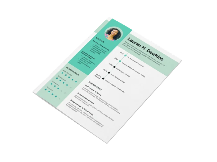
When creating your resume, keep in mind the industry you work for and the type of mindset that will review your resume. In this case, the modern resume example above keeps it simple, but still informative and visually appealing.

Each icon around Emilie’s picture represents what her personality traits are, all combining into one full circle. Next, she shows a clear vision of how strong her skills are, without using any additional words. With the use of large headings, it’s easy to determine what each section is about and quickly read over the material, without feeling overwhelmed.

The use of color against the negative space provides a clean, minimalistic look, making it stand out through a pile of resumes. Also, be sure your contact information is clearly listed, and easy to find, just like this modern resume example.


3. Sleek Red & Black Modern Infographic Resume Example


Creator: Fernando Báez

Type: Simple Modern Resume Example

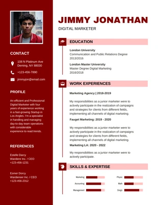
This creative resume template is the ultimate package deal, from the cover letter to the resume; each page keeps the audience entertained.

The bold use of color and typography fits right in with his job title and what he loves, something you learn from the first sentence you read! Instantly making you understand his design choice for the creative resume template, even if you thought it was too bold, it all makes sense now.

As a general rule, try to keep your resume under two pages, but in this case, it didn’t apply. There is a great deal of negative space to make the information spaced out through each page; it’s not full of cluttered text like the rest. Each design element is unique, I mean, he even uses a graph to display his social skills!


4. Minimalist Floral Resume Template


Creator: Venngage

Type: Creative Minimalist Resume Example

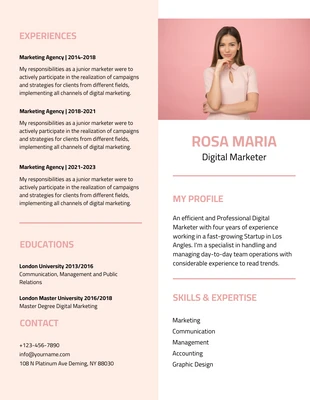
How have we never thought of using a background image to frame our resume before? In this creative resume example, the designer used the last name as inspiration for the border, making it fit right in.

If you want to play it safe when applying for jobs, use this creative resume example to add color, and still be respectful of the classic design.

There are two different font styles present, but gives the appearance of three. Showing how different font weight can really affect the appearance. Keeping a minimalistic design can get the main points through and make the reader want to reach out for more details, successful way to score an interview right?


5. Innovative Folding Creative Resume Example

Creator: Laura Voet

Type: Innovative Resume Example

Over the years the design of resumes has really evolved, and this creative resume idea is a great example. As a graphic designer, you can really enjoy the role the typography and lines play in this resume! The name and title dominate the page instantly, leaving no doubt about the skills of the candidate.

My personal favorite from this creative resume idea is the type of references the designer produced. For your resume, it doesn’t have to be the same people, as that can be very risky without knowing whom your end audience is, you can alter it to reflect your references. The margin and use of headings make it look like an excerpt from a book, altering the resume experience altogether!


6. Personal Branding Creative Resume Example

Creator: Matteo Innominato

Type: Personal Branding Resume Example

The callout gets my attention and makes me start reading right away. The entire illustration of this creative resume design gives the audience a taste of how talented the candidate really is! The reoccurring yellow in each section creates a sense of consistency and feeling of a theme.

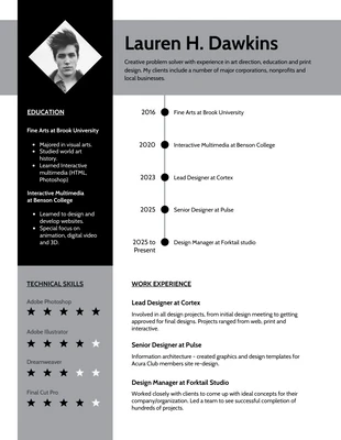
It’s neat how the designer used a timeline to list his learning experiences. For years we have used the same way to list our work experience, but why haven’t we tried a timeline before? It’s much easier to comprehend and imprints on your mind. Even the level of each skill is shown through a graph, all taking us back to the basics we learned when we were young, and now it comes back in an artistic form. Certain words are bolded in yellow that make it pop and give the reader a quick glimpse without having to read the full text.


7. Futuristic Purple Infographic Resume Template


Creator: Venngage

Type: Creative Infographic Resume Example

The colors in the picture are repeated again to show what the candidate is about in this creative resume layout. Bringing color and life to a section where it starts to get more serious. The heading of the resume consists of icons that show different ways you can reach out, making it easier for the eye to jump to the medium you want. Notice how this frame lines up perfectly with the size of the picture, balancing out both elements.

From all of the examples provided, you can see the new trend of visually showing a level of expertise in each skill, just like this creative resume layout. It’s a quick and easy way to show what your capable of, without having to add excessive text to your resume.


8. Double Exposure Minimalist Resume Example

Creator: Cristian Martínez Castellar

Type: Creative Minimalist Resume Example

The image overlay in this minimalist resume example makes you feel like your viewing the soul of this candidate, just as a resume teaches you about a person. We have come to be more accepting and receptive to resumes that think outside of the box, what better way to show it?

This minimalist resume example even lists a QR code should you prefer to view it electronically, making it more accessible for the reader. Each section is carefully balanced out under the main image, respective to the margin, providing a clean, organized look. Though this resume is grayscale, the image sucks the user in, and with the use of concise words, the reader’s attention stays put.


9. Colorful Infographic Resume Example

Creator: Alysa Choudri

Type: Creative Infographic Resume Example

There is a great deal of noise present in this infographic resume design, but with it being repetitive through the page, you know it’s intentional. Looking at each element, it looks as if something is loading, from the top to the bottom. Sure enough, the very last section on the bottom right is a full circle image indicating the perfect fit. This neat representation resembles the idea of searching through candidates for the perfect fit, once located, it’s 100% complete.

When incorporating such an infographic resume design, ensure your text is easily legible from a distance. If the manager can’t read it from the first instance they look, they won’t bother moving forward. Make it easy for them, requiring minimal effort.


10. Creative Photographer Resume Template


Creator: Venngage

Type: Creative Resume Example

Due to the nature of this industry, this photographer resume template can be used as a preview for the hiring manager. For a photographer, you don’t need to read long bodies of text to see what their skills are and whom they have worked with! All you care about is what the images look like and how well you can work with them. The use of a high res image can be the start of attracting the audience.

With the resume being split into two different sections, you can easily jump to the text and read through quickly. Clear and concise is key. The white space helps balances the information through the page and helps make it legible.

This photographer resume template provides a link to showcase their portfolio, and to me, this is where the real test begins.


11. Bold Black & Yellow Horizontal Resume Example

Creator: John Gatapia

Type: Creative Horizontal Resume Example

Who knew changing up the orientation of a page could be visually effective for this creative resume example? We’ve always thought about changing up design choices for a stronger impact, but this simple change really made it stand out from the pile. The bold choice in colors adds to this effect, the contrasting black and yellow not only stands out in a crowd but also makes it easy to read.

In a way, the creative resume example gives the appearance of a brochure design with the sections divided into three. Companies today want to see if a candidate will fit into their corporate culture, and get along with others. The X-factor and Cool Features section in this template makes all the difference and will help them answer these questions.

Find out the needs of the company you are applying to, and cater to them through your resume.


12.  Abstract Creative Resume Template


Creator: Venngage

Type: Creative Resume Example

The colors in this creative resume template give a fun, approachable feel.

When a job is posted, there are a lot of resumes to sift through, making it repetitive and monotone for the reader. Spark a feeling in the reader that will not only catch their attention but make them happy to read your resume, trust me, it will increase your chances!

Each section in this creative resume template is clearly defined by a bold color choice; bringing life to a flat design. The contrast of color for the icons, text, and headings against the background all make it legible with ease.

Notice how the designer used a light grey background to make the name and title pop out. In a way, all the other sections wrap around the name, making it a focal point.


Now if you want to learn more about creating your own resume I would recommend checking out this article:

infographic resume template

20+ Infographic Resume Templates and Design Tips to Help You Land That Job