


Did you know that 46% of people can’t sit through a presentation without losing focus?
That’s why I wanted to learn how to make a presentation that will captivate an audience. After looking at hundreds of different authors, topics and designs, I’ve assembled over 100 presentation ideas and tips on how to design a compelling presentation for:
- Social media
- Meetings
- Classrooms
- Webinars
- Online courses
- Pitch decks
- Lead generation
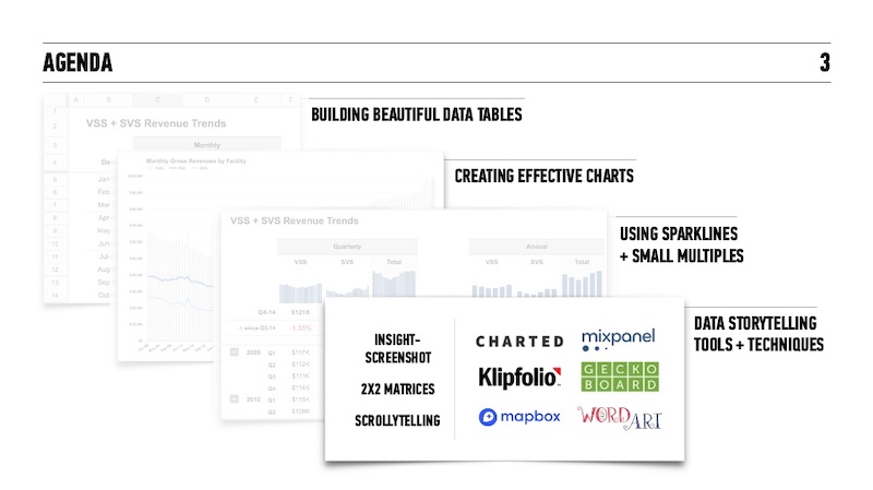
In this blog, you’ll find 120+ presentation ideas, design tips and examples to help you create an awesome slide deck for your next presentation.
To start off, here’s a video on the 10 essential presentation design tips to make sure that your presentations don’t fall under the YAWN category.
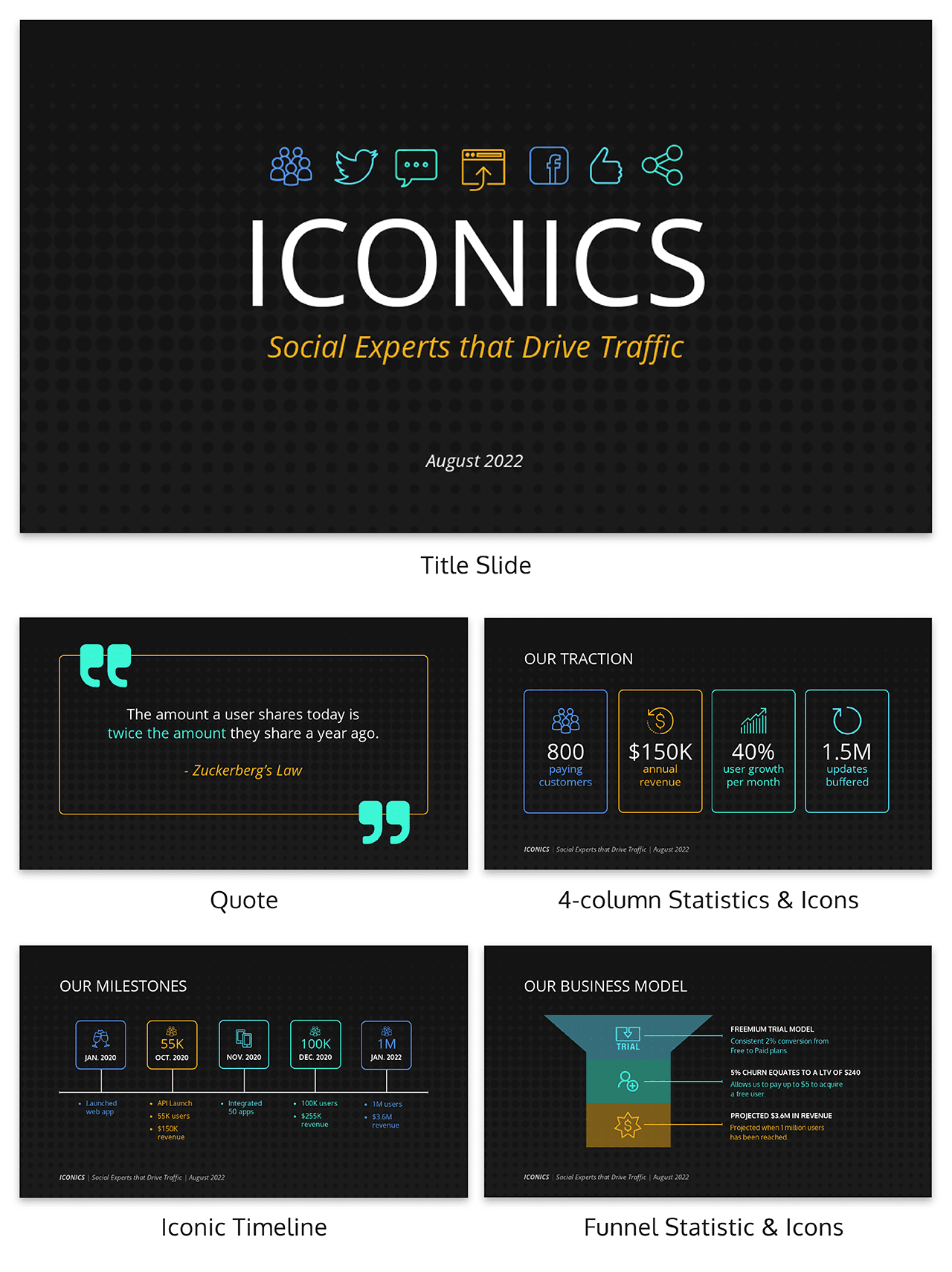
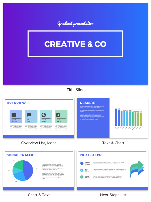
1. Use a minimalist presentation theme
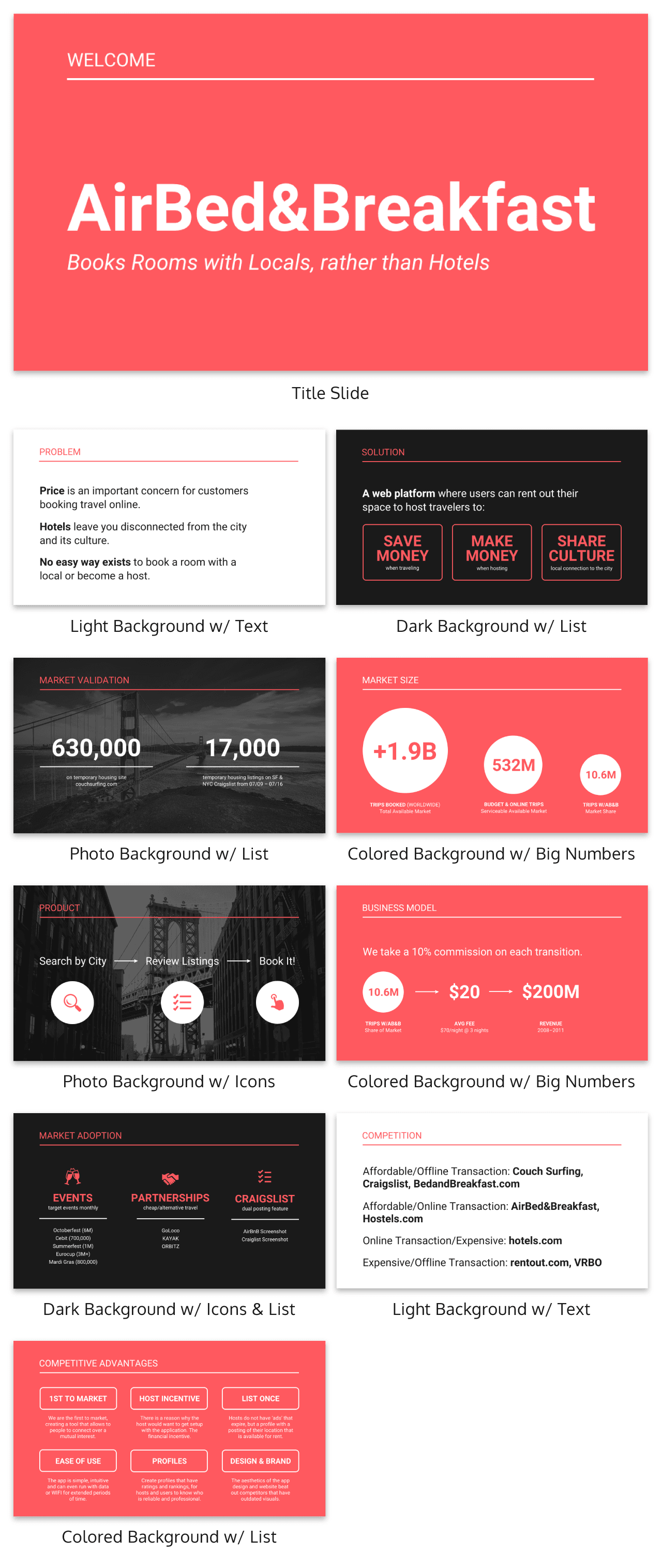
The best designs can also be some of the simplest you see. In the Airbnb pitch deck below, they use a minimalist color scheme and font selection.

A minimalist design is sleek, organized and places the most important thing in focus: your information. There are no distracting stock images, icons, or content. Everything on this unique presentation feels like it belongs and works together perfectly.
Learn how to customize this template:
2. Use a consistent design motif throughout your presentation
Here’s a go-to tip to for a cohesive presentation design: use a design motif. The motif could be a recurring shape (like circles, lines or arrows) or symbol (like a leaf for “growth” or a mountain for “goals”). For more ideas, check out our guide to common symbols and meanings used in design.
For example, this presentation template uses circles as a design motif. The same circle icon is used in three different colors to add a bubbly touch to the design. The team photos are also incorporated using circle frames:
3. Use an eye-catching presentation background image
Like with any type of design work, you should want to catch the eye of your audience. In a presentation, this should be done from the beginning with a compelling background image or a color gradient.

In this presentation template, the creators were able to do just that with a landscape photo. When a presentation like this is seen on social media, during a webinar or in person, your audience will definitely listen up.
4. Visualize your points with icons
Icons are the perfect visuals to include in presentations. They’re compact and can convey a concept to your audience at a glance. You can even combine multiple icons to create custom illustrations for your slides.
Use the Icon Search in Venngage to find illustrated and flat icons:
5. Use a black & white color scheme for a corporate presentation design
In the presentation below there are only two colors used: black and white. Now, you might be worried that only using two colors is boring, but it all comes down to balance.
Playing off the ideas of classic minimalism, the designer made this presentation look sleek and professional. And now your content can be the main attraction of your presentation as well!
6. Repurpose your slide deck into an infographic
Different types of presentations serve different purposes and sometimes it helps to work smarter, not harder when you are creating a unique presentation. In fact, the spacing, layout, and style used in this presentation makes it easy to repurpose the same images into an infographic.
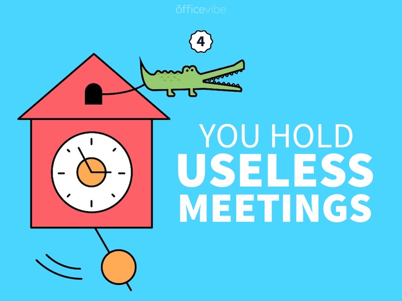
This allows you to create two unique pieces of content from one idea! Which is exactly what Officevibe did.

Join Venngage’s CEO, Eugene Woo, to learn how you can design impactful infographics that will help maintain trust, increase productivity and inspire action in your team.
7. Break your genre mold for a fun presentation idea
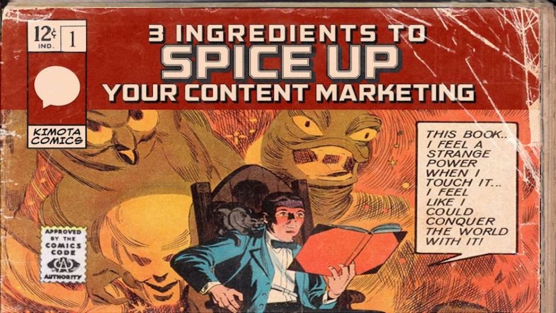
When I first clicked on this creative presentation from SEMrush, I was not expecting to be transported into a comic book. I’m glad I clicked because it may be the most unique slide deck I have ever seen. Going this extreme with your presentation ideas may seem a bit risky, but to be able to break the mold in this age of cookie-cutter presentations is worth it.
To leave a lasting impression on your audience, consider transforming your slides into an interactive presentation. Here are 15 interactive presentation ideas to enhance interactivity and engagement.
8. Make your presentation cover slide count
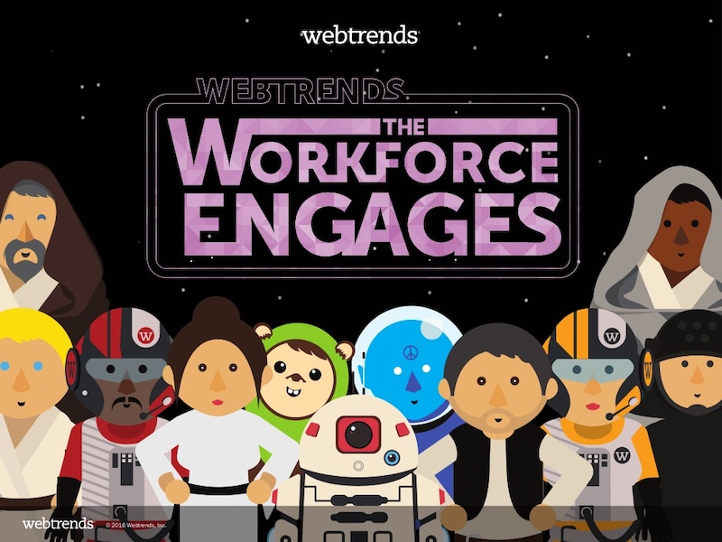
As I was scrolling through all of the presentations, this one made me stop in my tracks. It could be that I have a life-long love of Star Wars, or it could be that their presentation cover slide was designed to do just that: grab your attention. That’s why you should not stick with a boring, text-only title slide. Don’t be afraid to use icons and illustrations to make a statement.
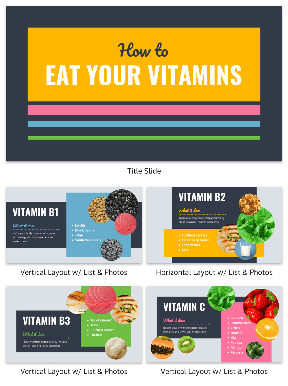
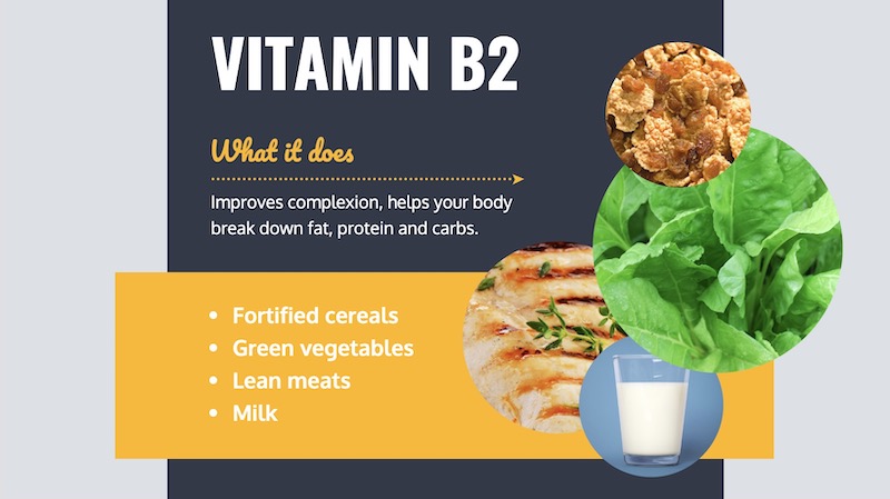
9. Alternate slide layouts to keep your presentation engaging
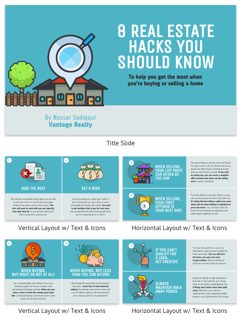
Keeping your audience engaged throughout an entire presentation is hard, even if you have been working on your presentation skills. No one wants to look at slides that look exactly the same for an hour. But on the other hand, you can’t create a unique masterpiece for each slide.


That’s why I’m very impressed with what the designers did in the presentation example above. They use a consistent visual theme on each slide, but alternate between vertical and horizontal orientations.
The swapping of orientations will show people that the presentation is progressing nicely. It can help you make a strong, almost physical, distinction between ideas, sections or topics.
10. Make your audience laugh, or at least chuckle

Sometimes you need to not take your business presentations too seriously. Not sure what I mean? Go check out slide number 10 on this slide deck below.

If you did not actually laugh out loud, then I don’t know what to tell you. Small illustrated embellishments can be very powerful because they evoke an emotional response and to gain your audience’s trust.
Did you know 70% of employees think that giving a good presentation is an essential workplace skill? Check out the top qualities of awesome presentations and learn all about how to make a good presentation to help you nail that captivating delivery.
11. Supplement your presentation with printed materials

Printed takeaways (such as brochures and business cards) give audience members a chance to take home the most important elements of your presentation in a format they can easily access without using a computer. Make sure you brand these materials in a way that’s visually consistent with your slide deck, with the same color scheme, icons, and other iconic features; otherwise, your recipients will just end up scratching their heads.
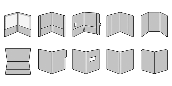
If you’re giving people multiple materials, try packaging them all into one convenient presentation folder. There are over 100 styles with a wide range of custom options, so feel free to get creative and make your folder stand out. Sometimes a unique die cut or an unusual stock is all you need to make something truly memorable. Here are some brochure templates to get you started.
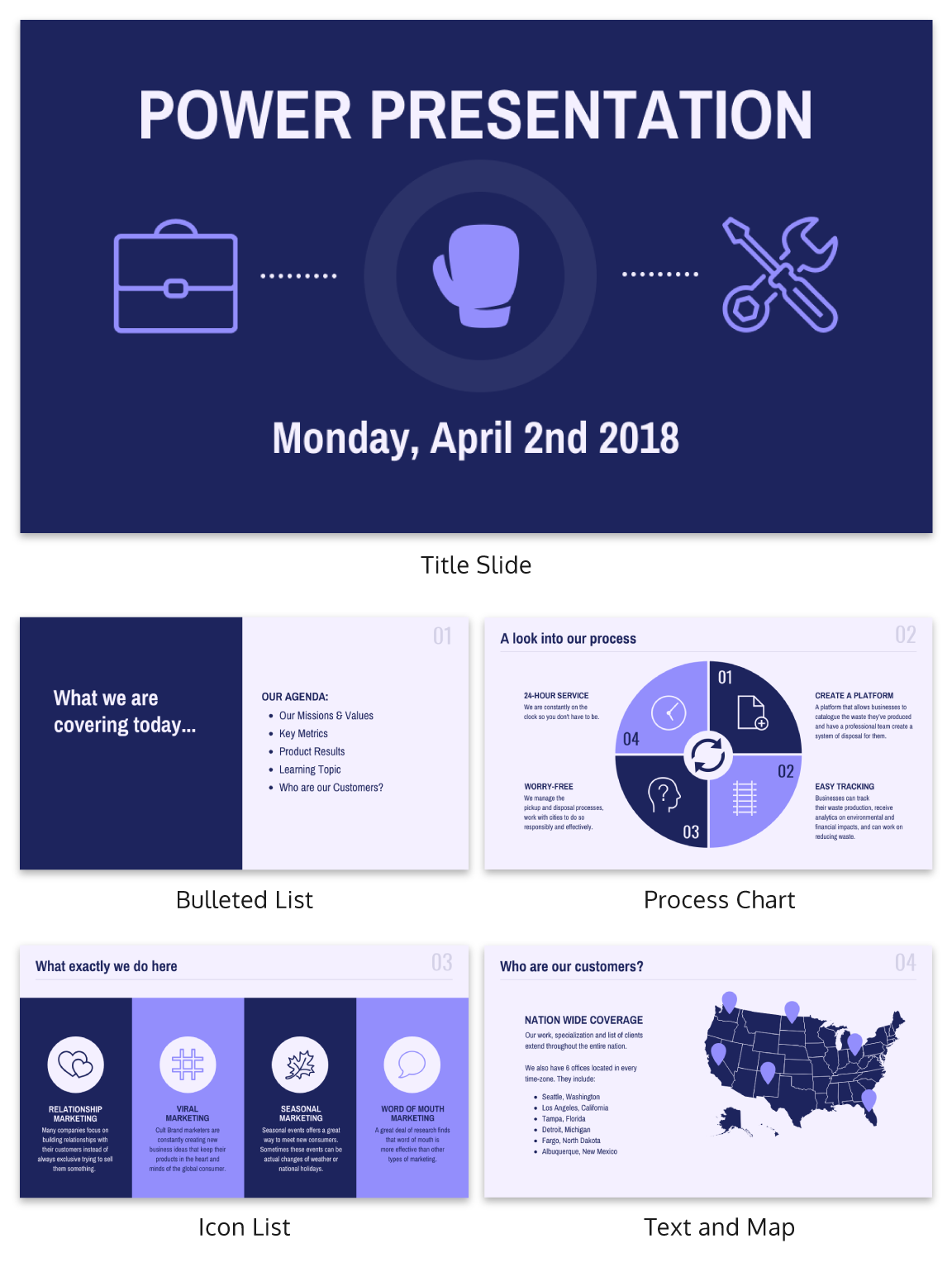
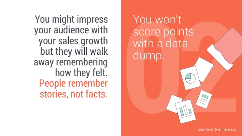
12. Only use one chart or graphic per slide

Having too much information on a slide is the easiest way to lose the focus of your audience. This is especially common when people are using graphs, charts or tables.

In this creative slide deck, the author made sure to only include one focal point per slide, and I applaud them for it. I know this may sound like a simple presentation tip, but I have seen many people lose their audience because the slides are too complex.
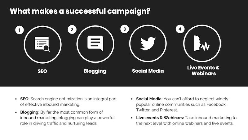
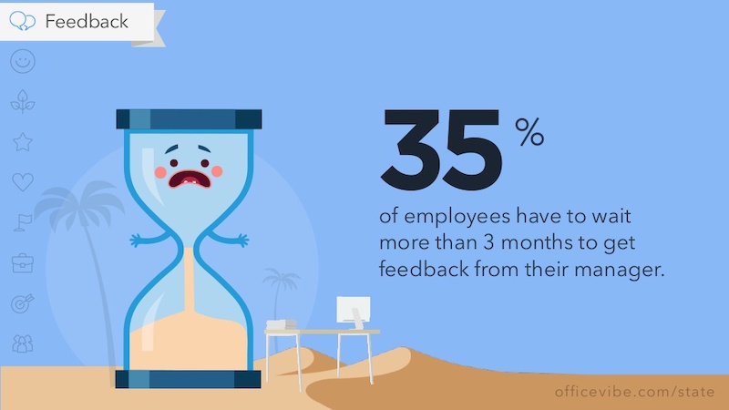
13. Keep your employee engagement presentations light
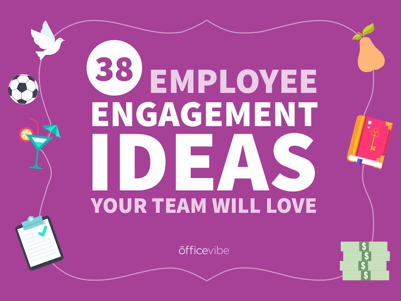
Sometimes you need to get away from stuffy, professional presentation ideas to capture your audience’s attention. In this case, Officevibe used some very colorful and playful illustrations to stand out from the crowd.

I mean, who could not love the plant with a face on slide number 9? And if you want to see some more icons and illustrations like this, be sure to check out our article on how to tell a story with icons.
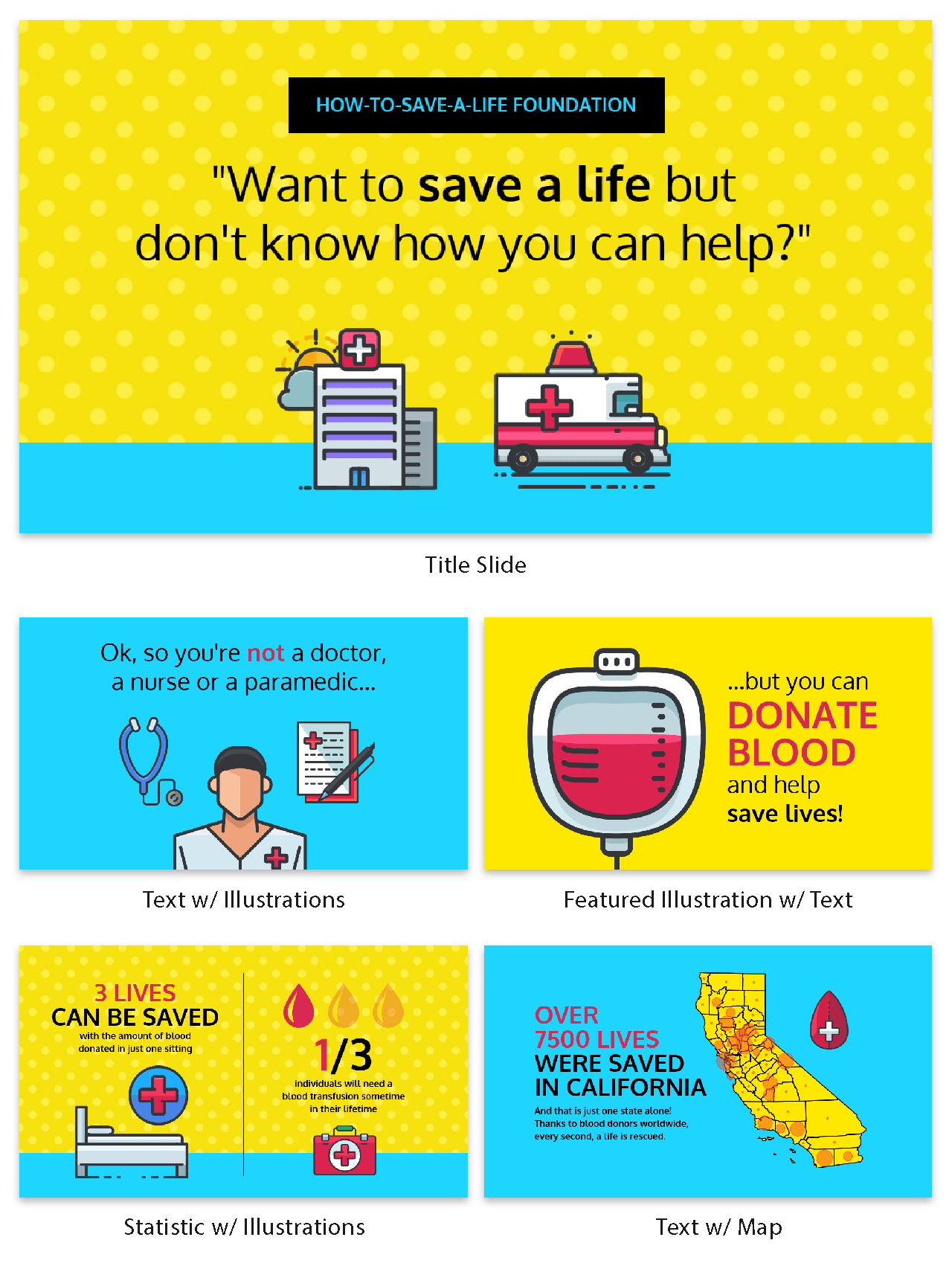
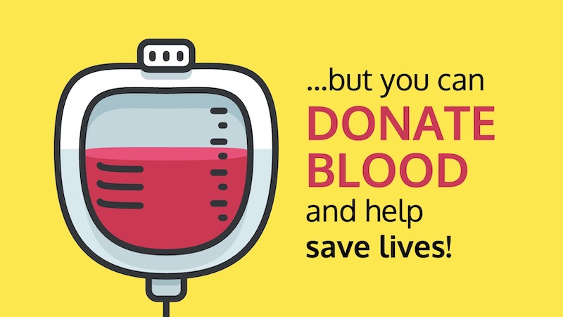
14. Feature a map when talking about locations
Including a map in your creative presentations is a fantastic idea! Not only do they make an interesting focal point for your slide layout, they also make location-based information easier to understand.

This cool presentation example by our pro designers at Venngage uses maps to visualize information. This map both dominates the screen, and also displays all the locations being covered.
15. Use a font that is large and in charge
If you are presenting to a small group or a packed stadium, make sure your audience can see your text! Use a large and in charge font that can be read from even the nosebleed seats.
Honestly, you really never know where your unique presentation will be seen. It could be seen in a conference room or conference hall, and everything in between. Be ready to present almost anywhere with a bold and easy to read font.
16. Use pop culture references to build a fun presentation

Using a meme or pop culture reference is another way that you can jive with your audience. It can be used to quickly get a point across without saying a word or create a moment that you can connect with the room. For example in this presentation, they used Napoleon Dynamite to give the audience feelings of nostalgia.
17. Use more than one font weight on your presentation cover slide
Just like you would never use one font on an infographic, you should never use just one font on your presentation (for more tips, read our guide on how to choose fonts). In this presentation example from HubSpot, they use a bunch of different font weights to add emphasis to key words and ideas.
As you can see, they use a bold font on the presentation cover to bring attention to Steve Jobs name. This makes it easy for the audience to know what your presentation is going to be about from the beginning as well.
18. Use a color theme for each idea
Color is another extremely powerful nonverbal tool that you can use to guide your audience. By using a different color for each section of your creative presentation, Dell is able to clearly indicate when they are switching points or ideas. Going from green to orange, and even red almost effortlessly.

This is a great way to design a list, guide, or a how-to presentation as well. And each color can be assigned to a different step or number with ease.
Need help picking the perfect color palette? Start here!
19. Use illustrations instead of pictures
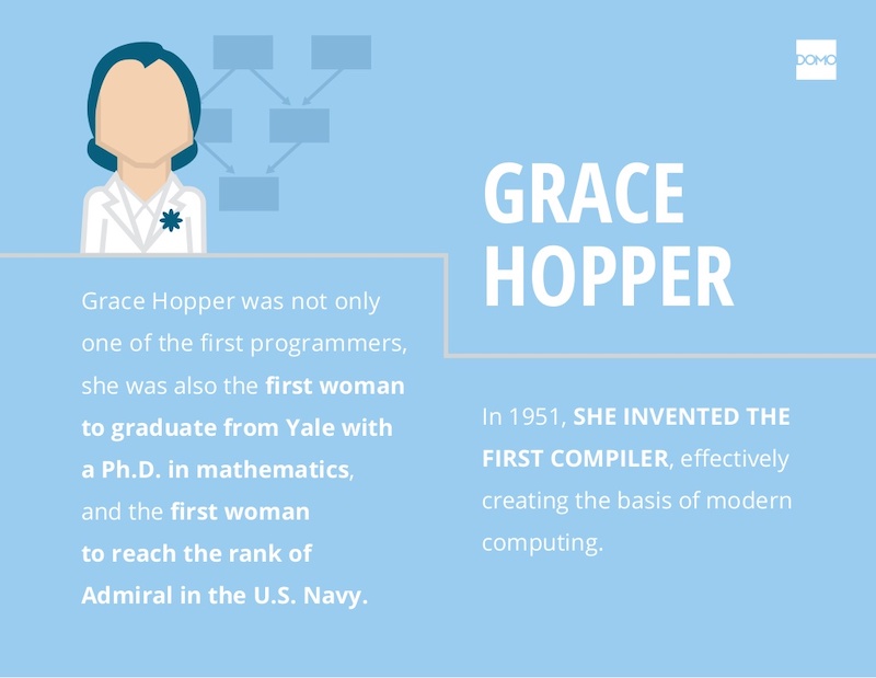
An easy way to keep your design consistent throughout your unique presentation is to use illustrations like in this slide deck by Domo.
They used illustrations instead of pictures to show off their subject on slide numbers 4-10 and it looks fantastic. This will ensure that the audience focuses on the content, instead of just the photo they could have used.
It also helps that illustrations are a top design trend for 2020.
20. Use contrasting colors to compare two perspectives or sides of an argument
Contrasting colors can be used to quickly show each side of topic or an argument. For example in this presentation, they use this trick to show the difference between their company and the competition.
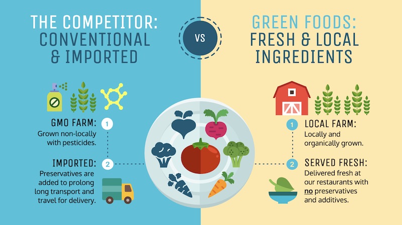
They use color very effectively in this example to show their company is better, in a nonverbal way. With a lighter color and illustrated icons, the company is able to position them as the better choice. All without saying a word.
Now if they would have used similar colors, or a single color the effect wouldn’t have been as strong or noticeable.
21. Include your own personal interests
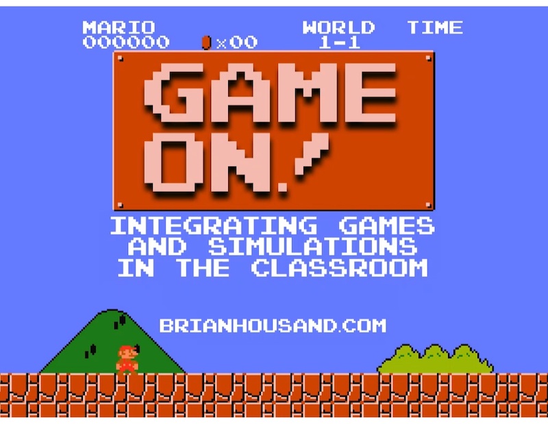
This example is one of the most interesting and cool presentations I have seen in awhile, so I suggest checking out the entire thing. The creator inserts a bunch of his personal interests into the slide to make his presentation about education fun and relatable. And they even use a Super Mario Bros inspired presentation cover, so you know it has to be fantastic!
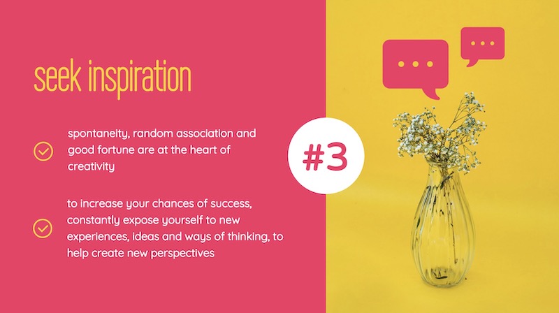
22. Try to stick to groups of three
How many major ideas should be present on your presentation aid? Never break your presentation layout down into anything more than thirds. This means there should be at most three columns, three icons, three ideas and so on. A great example of this idea starts on slide number 9 in this slide deck and continues throughout the rest of the presentation.
Here is a great three columned slide template to get started with.
23. Add a timeline to help visualize ideas
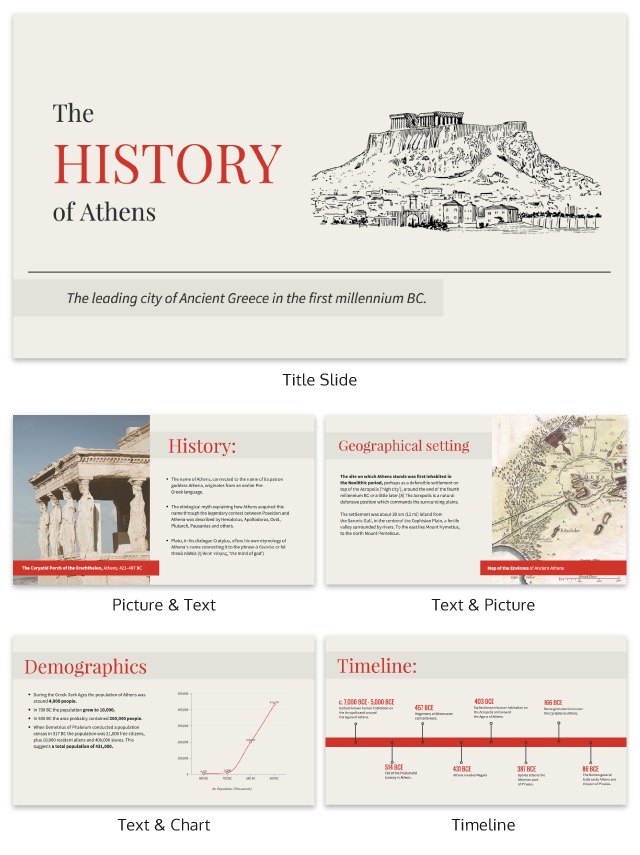
One of the best ways to visualize a complex process or historical event is to use a timeline presentation. A list of all the steps or events is just not going to cut it in a professional setting. You need to find an engaging way to visualize the information.
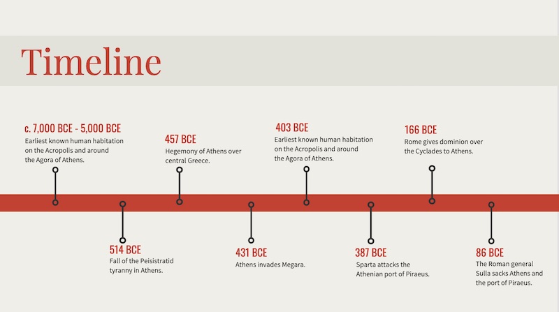
Take the presentation example above, where they outline the rise and fall of Athens in a visually stimulating way.
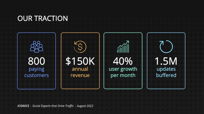
24. Label your graphs & charts
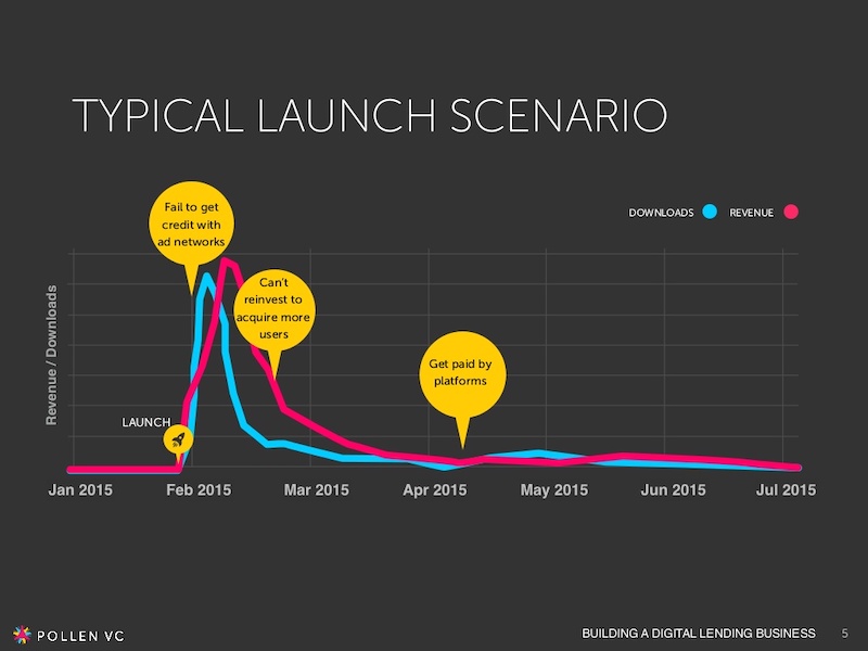
If the people at Pollen VC had not added those annotations to the graphs on slide number 5, I would have definitely not known what to make of that graph.
But when you combine the visuals on a graph with descriptive text, the graph is able to paint a picture for your audience. So make your graphs easy to understand by annotating them (this is a chart design best practice).
Create a free graph right here, right now!
25. White font over pictures just works
There is a reason that you see so many quotes or sayings in a white font that are then overlaid on an image. That it is because it just works in so many situations and the text is very easy to read on any image.
If you do not believe me, look at the slide deck example above where they use a white font with a few different fonts and about 100 images. Plus the presentation template is chocked full of other tips on how to create a winning slideshow.
26. Color code your points across the whole presentation

Here is another example of a presentation that uses color to keep their points organized. In this case, they use 10 different pastel colors to match the 10 different tips for employee engagement.
Check out our guide for how to pick the best colors for your visuals.
27. Use a simple flow chart to break down a process
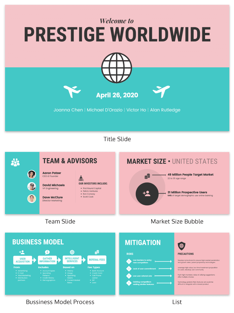
If you’re a fan of the movie Step Brothers, you may have heard of Prestige Worldwide before. In this fun presentation example they are back to sell you on their business model and growth plans.
This time, the presentation will be effective because it actually talks about what the business does.
Instead of making a music video, they use a helpful flowchart template to explain their business model. I would recommend following their lead and creating a dynamic flow chart to visually break down any process. Try making your own flowchart with Venngage.
28. Make your slide deck mobile friendly
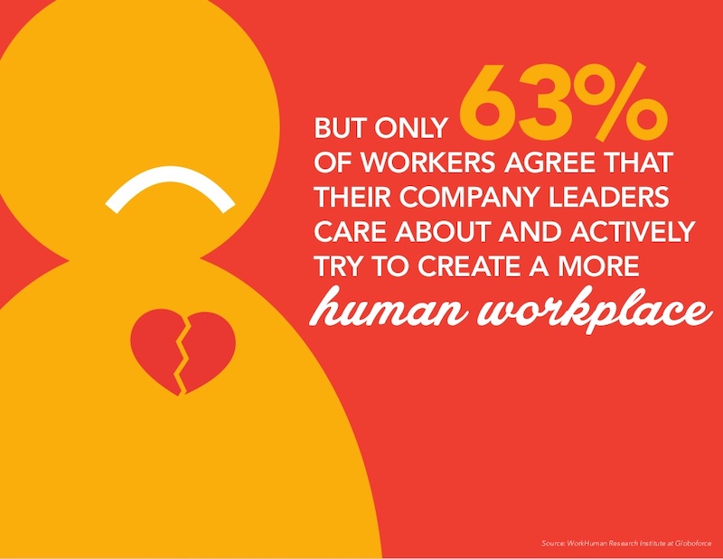
As more people move to mobile as their main device each year, making your presentations mobile-friendly is becoming increasingly important. This means that the text is large and there aren’t too many small details, so everything can scale down. Just like in this presentation example from the creators at Globoforce.
29. Don’t be afraid to include too many examples
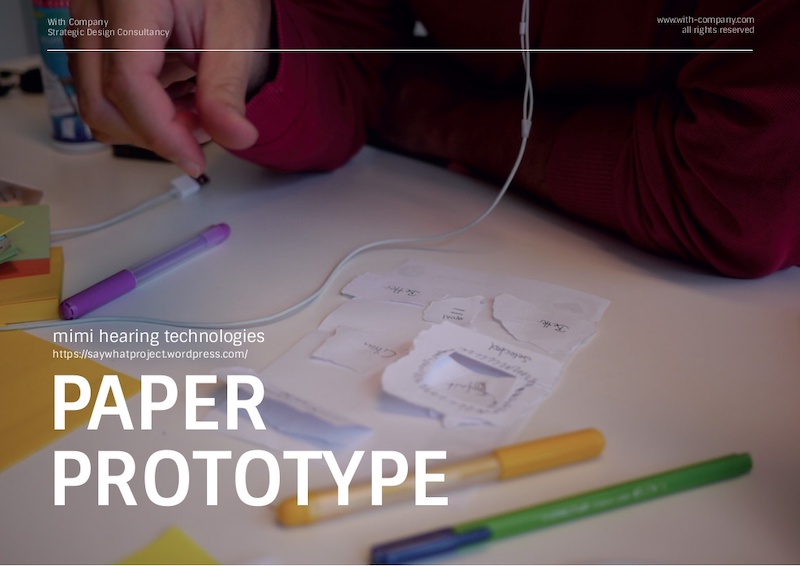
If you are presenting a complex idea to a group, especially a large audience, I would recommend having a ton of good examples. Now, I would try not to overdo it, but having too many it is better than having too few.
In this creative presentation, the people at With Company spend about 20 slides just giving great examples of prototyping. It doesn’t feel too repetitive because they all are useful and informative examples.
30. Use consistent visual styles for an elegant presentation design
I have already written extensively about using icons in all of your design projects. I haven’t talked as much about matching icons to your presentation template.
But that’s just as important, especially if you want to create a professional presentation for your audience.
As you can see in the example above, the designer used minimalist icons that fit the slide designs. All of the other graphics, charts and visual elements fit together nicely as well.
Plus the icons don’t distract from the content, which could ruin a stellar presentation.
31. Use a consistent presentation layout
In this example from Bannersnack, they use a consistent layout on each of their slides to help with the flow by using the same margins and text layout.
It’s a solid presentation example because they help the user know where to look immediately. It may seem like they are playing it safe, but anything that can speed up the time it takes for a user to read the content of the slides, the better.
32. Use loud colors as much as possible

This is one of my favorite presentations because of the highlighter yellow they chose to use as their main color. It is actually very similar to one that I saw presented live a few years ago and I have used this same approach in a few presentations ideas of my own.
33. Pull your design motif from your content
If you are talking about an interesting topic, why not use the topic as the main design motif in your creative slide deck? For example, in this presentation about sketchbooks, the creator uses a sketchy, handwritten motif. It is something simple that helps the audience connect with the topic. Plus, it allows you to include a ton of great examples.
34. Utilize a call & answer cadence
In this SlideShare about how to create a presentation, Peter Zvirinsky uses a two-step process to present a point. First, he presents the header presentation tip in a speech bubble. Then he shows a supporting point in a responding speech bubble. This gives the presentation a conversational flow.
35. Repurpose ebook content into a creative presentation

This slide deck was adapted perfectly from a Seth Godin ebook into the presentation example you see above. In the slide deck, they take a piece of content that would usually take a while to read and cut it down to a few minutes. Just remember to include only the most important ideas, and try to present them in a fresh way.
36. Add a timed outline to your presentation
We have already covered how important it is to have a table of contents in your slides but this takes it a bit further. On the second slide of the presentation below, the creator added how long each of the slides should take.
This is great because it helps your audience know the pace the presentation will take and will help keep them engaged. It also will help them identify the most important and in-depth parts of the presentation from the beginning.
37. Use a “next steps” slide to direct your audience
One of the worst things you can do as a presenter is to leave your audience without any idea of what to do next. A presentation should never just end because you ran out of slides.
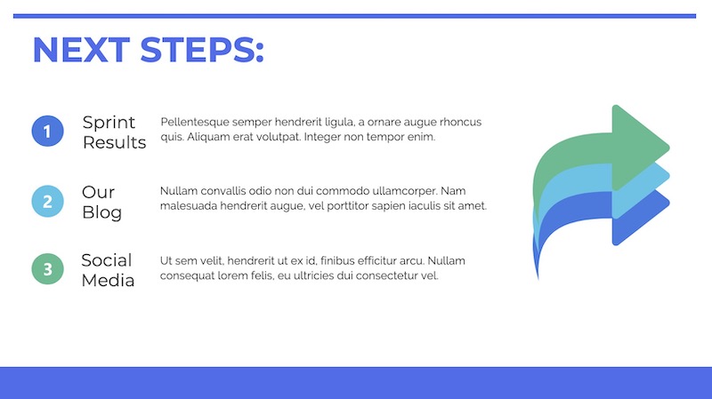
Instead, use a conclusion or “next steps” slide like in the example above to finish your presentation. Sum up some of your main points, tell your audience where they can get more information, and push them to take action.
38. Go a bit crazy with the design

Sometimes you need to throw convention to the wind to create something unforgettable. This presentation from Velocity Partners does just that, and I think it is one of my favorite ones from this entire roundup.
They use unconventional typography, quirky icons, and unusual presentation layout to make each slide surprising.
39. Make your slide deck easy to share
If you are looking to get a lot of eyes on your presentation I would make sure people will want to share it on social media. How do you do that? By presenting new and interesting value. This means your content needs to answer a common question and your design needs to be clutter-free. For example, look at this very social media-friendly. The slides are simple and answer questions directly.
40. Use shapes to integrate your photos into the slides
Want to include a bunch of images in your presentation? I say do it!
Now most of the time you would add a raw image directly to your slide. However, if you want to present images in a professional way I would recommend using an image frame.
Like in the example above, you can use these frame to create a collage of images almost instantly. Or provide a similar visual theme to all of your slides.
Overall, I believe it’s a great way to add a new visual component to your presentation.
41. Hijack someone’s influence in your marketing slides

If you are stuck in the brainstorming phase of your presentation, focusing on a brand or influencer is a great place to start. It could be a case study, a collection of ideas or just some quotes from the influencer. But what makes it effective is that the audience knows the influencer and trusts them. And you are able to hijack their awareness or influence.
42. Put your logo on every slide

Whether you have a brand as powerful as Moz, or you are just getting started, you should always have your logo on each slide. You really never know where a presentation is going to end up–or what parts of it will! In this presentation template, Moz does a good job of including their branding and such to get others interested in Moz Local. Don’t have a logo yet? Our logo design tips will help you create a logo that’s iconic and will stand the test of time.
43. Lead your audience to it

In this example, the creator uses something very similar to the call and answer approach I mentioned above, but with a little twist. Instead of just throwing all the info up at once, they use three slides to build to a particular point and include a subtle call to action in the third slide.
44. Make visuals the focal point of your presentation slides
If you haven’t noticed, illustrated icons are having a revival in 2020 and beyond. This is likely because minimalist icons dominated the design world for the past decade. And now people want something new.
Brands also like using illustrated icons because they are seen as genuine and fun.
And because they are so eye-catching you can use them as focal points in your presentation slides. Just like they did in the creative presentation example above.
Picking the perfect icon is tough, learn how you can use infographic icons like a pro.
45. Use a quirky presentation theme

In this slide deck, the authors show you how to become an Animation Ninja…and they use ninja graphics and icons extensively. This caught my eye immediately because of the amount of work that I knew was behind this. It takes a lot of time and effort to line all of the content and graphic up to create a cohesive theme, but the payoff can be massively worth it.
46. Use a consistent background image
I am a big fan of the way that Aleyda Solís uses only a single presentation background image throughout her presentation.
By using this tactic the audience is able to focus on what is happening in the foreground. Plus it gives the whole presentation a different feel than all the other ones I have looked at.
47. Summarize your points at the end
It’s a good idea to summarize your points before you end your presentation, especially if you’ve covered a lot of information. In this presentation example, Deanta summarizes exactly what they do on slide numbers 16-18. They also provide their contact information in case their audience has any more questions. I think that every presentation should use this same approach, especially the ones you are presenting outside of your company.
48. Use a minimalist presentation template
This slide deck from QuickBooks uses a minimalist theme to help the audience focus on what is important, the content.
There were only five colors used in the entire presentation and the graphics were simple line drawings. This made it easy to read and very pleasing to the eyes.
49. Split your slides length-wise

Here is a simple template you can use to separate your headers, or main points, from your body text in a presentation.
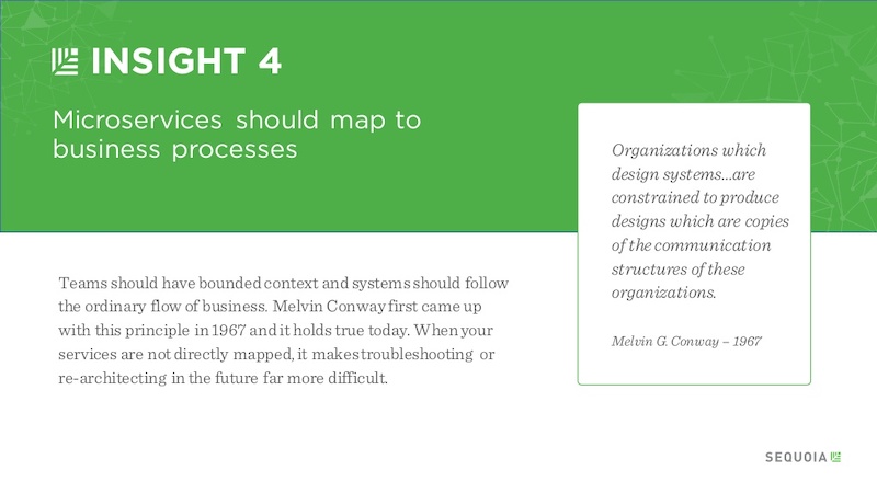
Instead of using a solid presentation background, split the slide in half like Sequoia did in their slide deck. They used their brand color for the title portion and a neutral white for the supporting content.
Use this company report template to create a very similar slide right now!
50. Embrace a bold color scheme throughout your presentation
My favorite part of the creative presentation example above is the use of complementary colors in each slide. As you can see, not one of the slides use the same color scheme but they all feel related connected.
This approach can be used to make your presentation visually unique, without abandoning a cohesive theme or idea.
51. Put text in the top left corner
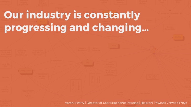
English speakers will instinctively try to read text from a top to bottom, left to right orientation. I would recommend using a left alignment for your text and adding additional things from top to bottom, just like Aaron Irizarry did in this presentation layout.
52. Break up your tables
A plain table with a white background with black or gray lines are difficult to read on a computer screen, so why would you create one for viewing on a large presentation screen? You shouldn’t!
Instead, follow Intuit’s lead and break up the rows with a bit of color. This applies to data visualization in general, but think it is even more important when it comes to presentations.
53. Present connected information in a visually similar way
In this startup pitch presentation example, they have a ton of information to get through. But they present their most important slides, the problem and solution, in a visually similar way.
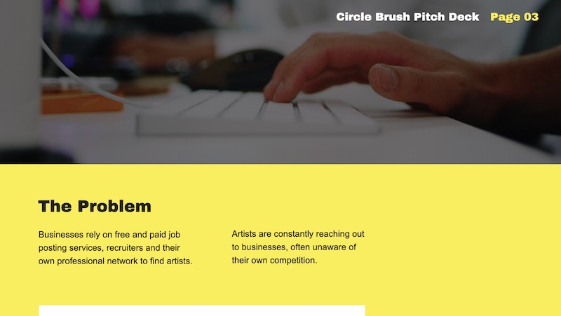
By using a similar layout on each slide, the audience will be able to quickly make a connection. If you want to present two connected pieces of information, use this tactic.
From the font to the layout, it’s all basically the same. The main message they’re trying to impart is a lot more impactful to the reader.
If they would have used two wildly different presentation layouts, the message may have been lost.
54. Roundup expert tips into one presentation
If you are looking for useful insights into the topic of your presentation, talk to some influencers in your niche. These are called “expert roundups” in the content marketing world and they are incredibly shareable.

Plus, they are pretty easy to create and have a great shelf life. In the example above, we talked to a gaggle of marketing experts about what makes a SlideShare great.
55. Use bold & brash colors throughout
Bold colors usually make your presentation template a lot easier to read and remember. Like at this slide deck made by our talented designers, which doesn’t shy away from bright, bold colors.
Want to pick a perfect color palette for your presentation? Read this blog on the do’s and don’ts of infographic color selection.
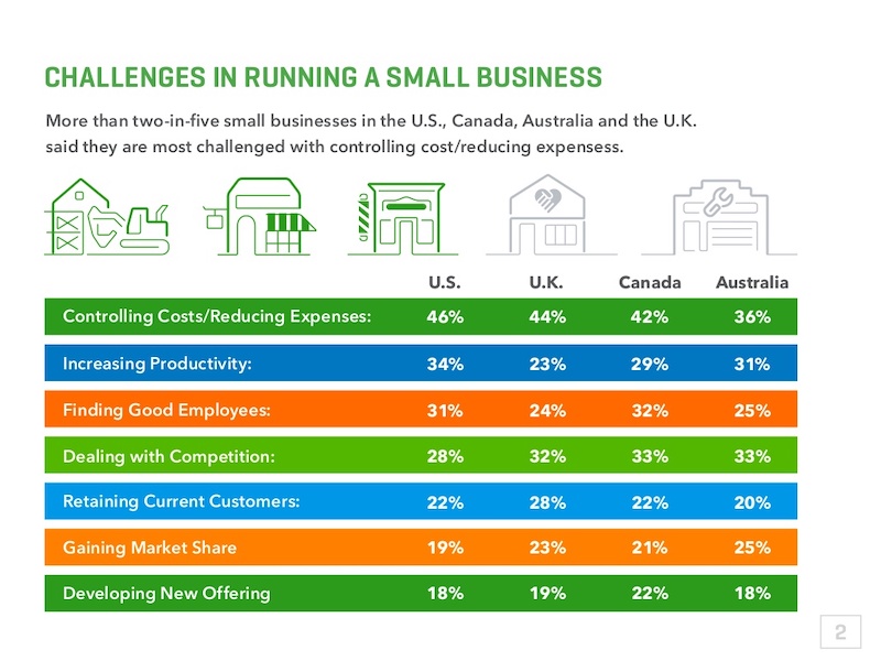
56. Make your graphs easy to read & interpret

It should not require a Master’s degree in statistics to understand the graphs that someone uses in a presentation. Instead, the axis should be easy to read, the colors should enforce the point, and the data should be clearly plotted.
For example, in this presentation on slide numbers 14 and 25, the graphs nail all of those tips perfectly.
57. Condense your presentation into a memorable line

If you can, try condensing your information into a simple one-liner to help the message stick with your audience. In slide number 36 of this presentation, Mika Aldaba does just that and shows that “Facts + Feelings = Data Storytelling.”
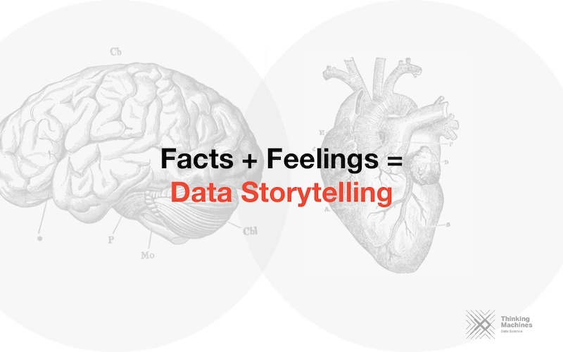
He does this again a few times throughout the presentation with other memorable one-liners.
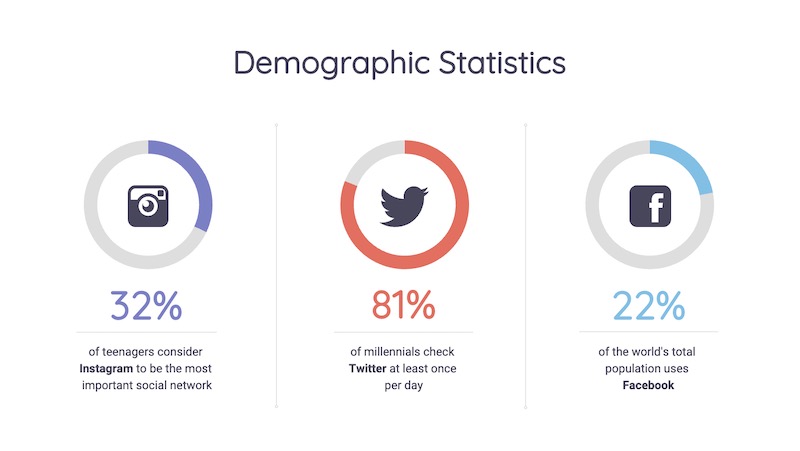
58. Bring attention to important figures with colorful icons
If you’re including a figure or number on your slides, I’m guessing you want the audience to actually see it.
That’s why I would recommend using an icon or graphic to highlight that figure. Maybe use a color or icon that isn’t used anywhere else in the presentation to make sure it really jumps off the screen.
In the presentation example above, all that’s used is a simple circle to make each figure a focal point. It’s really that easy, but many people leave it out of their presentations.
59. Anchor Your Text With Icons

Having your text or content floating out in the white space of your presentation is not a good look.
Instead, you should use anchor icons to give the text something to hold onto and draw the audience’s eye. If you need some examples of good anchor icons, check out slide numbers 4, 7 and 9 in this presentation example.
60. Add semi-opaque lettering as a presentation background

A neat way to keep your slide deck organized is to number your slides or points using semi-opaque lettering in the background.
Then, place your slide content on top of the opaque lettering. This helps your audience know that you are on the same point or idea, plus it just looks really good when done right.
61. Use simple or minimalist borders
An easy way to class up your slides is to put a border around your text. Take this presentation from Venngage that uses a couple of different types of borders to make their slides look professional.

Plus it helps keep all of your content contained on the slide!
62. Feature one idea per slide
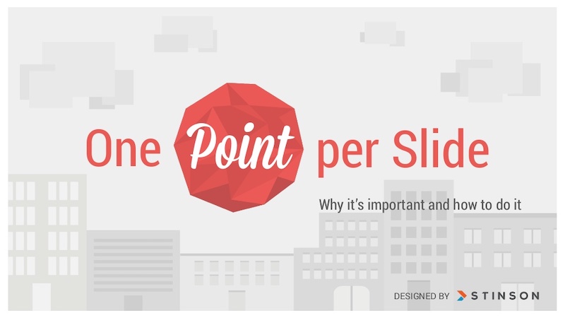
Nothing is worse than a confusing, cluttered slide. Instead of trying to pack a bunch of ideas into one slide, focus on one core idea on each slide. If you need to flesh the idea out, just make another slide.
Having trouble condensing your slides? Our presentation design guide can help you summarize your presentations and convey a singular idea with a clear focus.
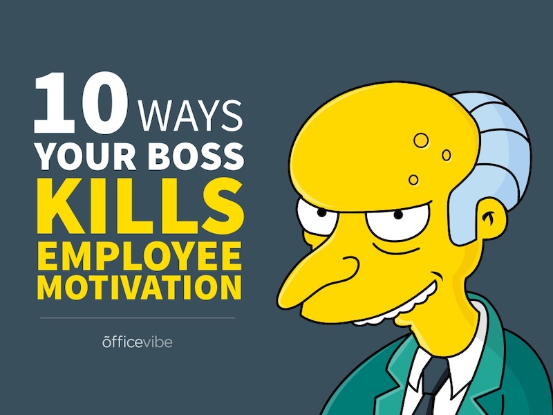
63. Keep your style consistent with your brand

You might be tempted to switch up the style of your creative presentations each time, but think again. If your brand is known for fun and lighthearted content, like Officevibe, let that be your style throughout all of the presentations you publish under that brand. This will make your slide decks recognizable and will enforce your brand’s message.
64. Use accent fonts to emphasize important numbers
Some people hate pie charts with a passion, but I think they are perfect for presentations. Especially if you want to bring attention to a figure or percentage point.
In this simple example, the pie charts are used to visualize each figure in an interesting way. Plus the pie charts fit the circular and fun theme of the rest of the presentation very well.
65. Use patterned and textured presentation backgrounds
Adding some subtle textures, icons or shapes to the presentation background can help make your slides more interesting. This is especially effective when you are only showing one point per slide, because it makes the slide design less sparse.

You can even switch up the colors on your shapes or textures to match the theme of the slide like DesignMantic did in this presentation.
66. Illustrate complex or confusing concepts with icons

Ideally, you don’t want every slide in your deck to just be text. Instead, switch things up every few slides by using just pictures.

This slide deck by Gluwa uses icons to create little diagrams to illustrate their presentation ideas. Their slides still communicate concepts to the audience, but in a new way.
67. Overlay stock photos with color

One problem many people encounter when creating a presentation or slide decks are finding photos with a consistent style. An easy way to edit photos to make them consistent is to add a transparent color overlay. In this example, Change Sciences uses a blue overlay on all of their photos. Plus, the color you choose can also help convey a particular mood.
68. Use black and white blocks

An easy way to make your text pop, particularly on a photo background, is to use white font on a black blog background (and vise-versa). Check out this slide deck by Abhishek Shah, which uses this trick in an effective way.
Now if you want to become a better leader this year, check out some of our favorite leadership infographics.
69. Use photos with similar filters
Using a bunch of photos with wildly different filters can be jarring in a business presentation. To maintain a consistent flow, use photos with a similar filter and color saturation.

Take a look at this example from HubSpot across slide numbers 1-6 and you can see what I mean.
70. Visualize your points with diagrams
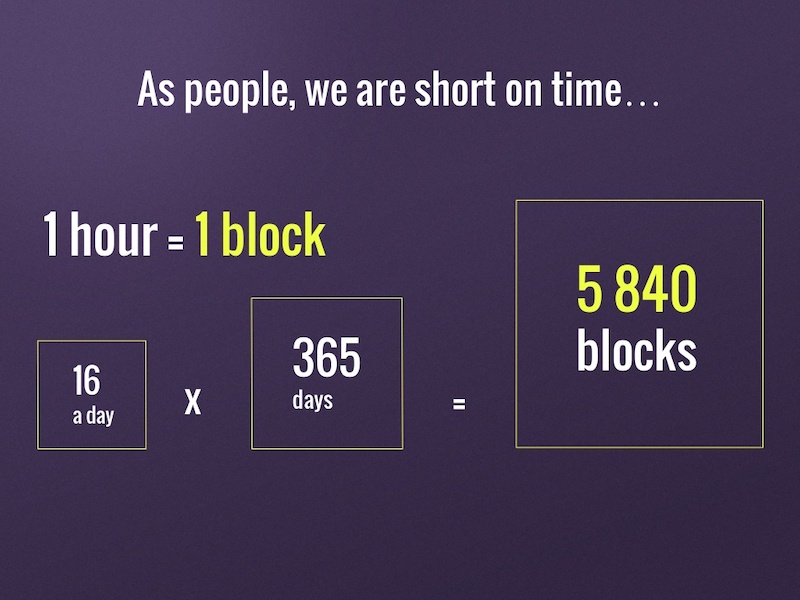
Sometimes the best way to get your point across is to throw some diagrams into the presentation mix. But be sure to make is something that the audience can pick up on in three to five seconds tops.
For example, Jan Rezab uses a diagram to illustrate what takes up time in our lives on slide numbers 4, 5, 7 and 9!
71. Get experts to share tips

If you want to provide even more value to your audience than you can offer yourself, why not call in some expert reinforcement? See what experts in your field have to say on the topic of your presentation and include their tips and insights. Plus you can hijack their influence and expand your audience fairly quickly.
72. Mimic a popular presentation style
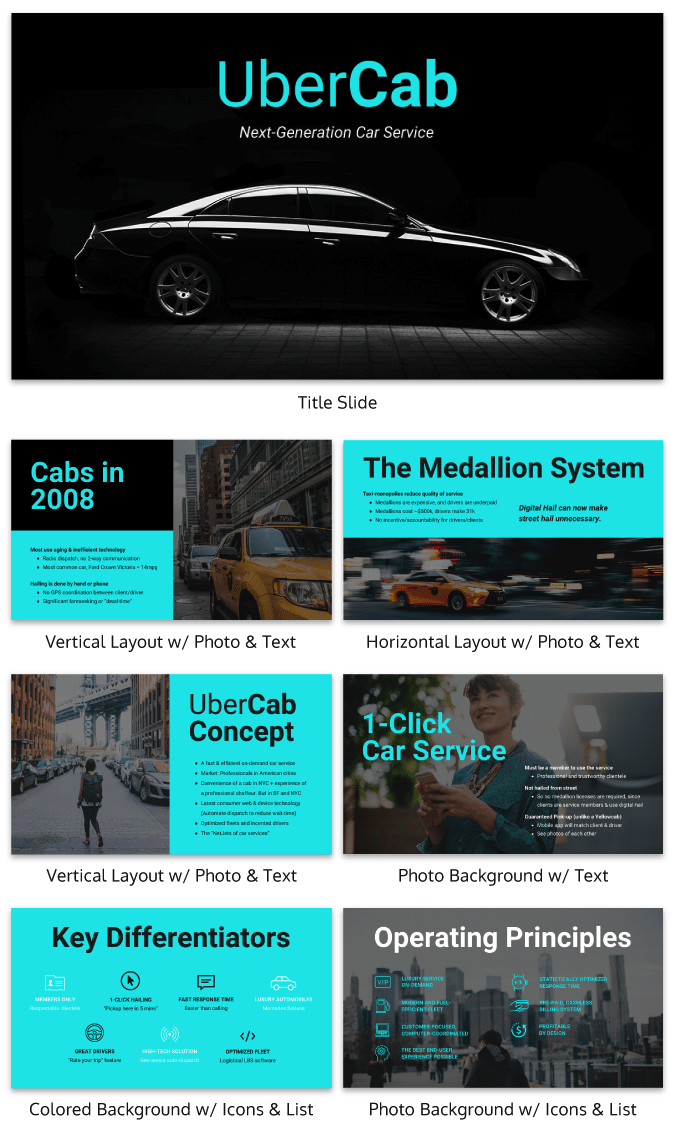
Uber’s pitch deck helped them raise millions of dollars in venture capital eventually leading to the glorious moment when they IPOed this year.
Aside from our sleek design upgrade (hey, we love good design!), this pitch deck template is the exact same one that Uber used to go from Idea to IPO.
And who knows? Maybe you might start the next Uber. But to raise money, you will need to create flawless business pitch decks to impress investors and raise those dollars.
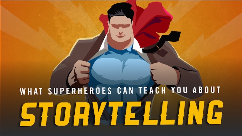
73. Plan your presentation idea ahead of time
I know that minimalist designs are all the rage this year, but there is a big difference between a well-thought-out minimalist design and a lazy design without the finish touches. The same goes for a cluttered design with too many things going on at once.

That’s why it’s worth it to take the time to really plan out your presentation ideas and design concepts. Take this slide deck about storytelling by HighSpark. A quick glance will tell you that they put a lot of thought into designing their slides.
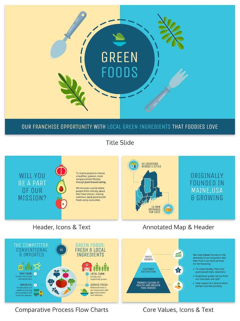
74. Use tables to compare your brand to the competition in sales presentations/pitch decks
There are a lot of ways to visually compare similar things in this day and age. You could use a comparison infographic, or even a venn diagram!
However, when it comes to presentations I think that the simple table is best. Especially if you are comparing more than two things, like in this presentation example.
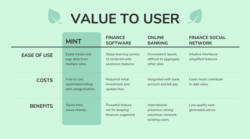
With a table, you can clearly lay out all the pros and cons of each idea, brand or topic without it being overwhelming to the audience. Plus, virtually everyone knows how to follow a table, so your information will be easy to consume.
See more examples of the best pitch decks.
75. Blend icons & content effortlessly
Usually, icons are used as eye-catching objects detectors or anchors for text in a slideshow. But they can be used for so much more than that!
Like in this marketing presentation from Constant Contact they are very large but do not distract from the content.
76. Make your audience want more
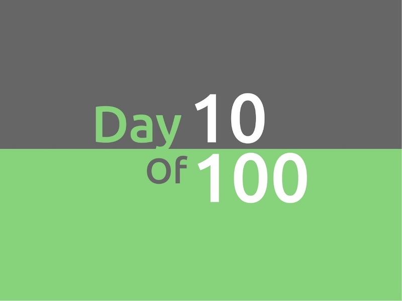
This tactic has been used by everyone since the idea of marketing was invented (or close to that). In this presentation example called “100 Growth Hacks, 100 Days” the creator only shows the audience the first 10 days of it and then uses a call to action at the end of the presentation to encourage them to seek out the rest.

The only risk with these kinds of presentation ideas is if your initial content is not great, you can’t expect your audience to seek out more information.
77. Use memes (for real, though)
Usually, memes do not have a place in a serious business setting, so maybe don’t use them for formal presentations. But if you’re covering a lighter topic, or if you’re going for a fun presentation that will connect with your audience, don’t be afraid to throw a meme or two into the mix.
The audience immediately knows what you are trying to say when you use a popular meme in your presentation. For example, on slide number 7, the creator uses a meme to show that it will be hard to create great content
78. Include a slide that introduces your team in pitch decks
In this presentation example, the creators decided to include their team on a slide. I think it’s a great gesture.
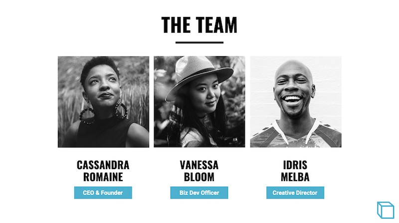
Showing your team can help the audience put a face to your brand and make the whole company feel more genuine. So if there is a team that has helped you get where you are today, give them some recognition!
79. Feature a complementary color palette

Even though I am not a formally trained designer, I still understand that proper color usage is the base of any good design. Although not all of the tenets of color theory work great for presentations, complementary colors are always a great pick.

Take a look at the color usage in this business presentation from Gary Vaynerchuk below. The purple and Snapchat yellow, which are complementary colors, look fantastic and the content jumps off the screen.
80. Use a heavy or bold font

The very back of the room should be able to read your content if you are giving a group presentation. To ensure that your entire audience can read the slides I would not only use a large font, but also use a heavy font. If you are confused by what I mean by a heavy font take a look at this unique presentation example by Slides That Rock.
81. Do the math for your audience
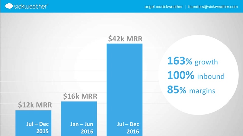
If you are going to use a graph in your presentation to compare data you should do the match for your audience. Do not make them do the calculations in their head because you will quickly lose their attention. For example, on slide number 5 the people at Sickweather lay out exactly what figures they want the audience to take from the slide.
82. Use unique colors for different sections
The example below has 145 slides but it does not feel overwhelming or confusing.
That’s because each section has a different corresponding color, which makes it easier to flip through the slide deck and find a particular part.
83. Give your presentation a catchy title that anyone can remember
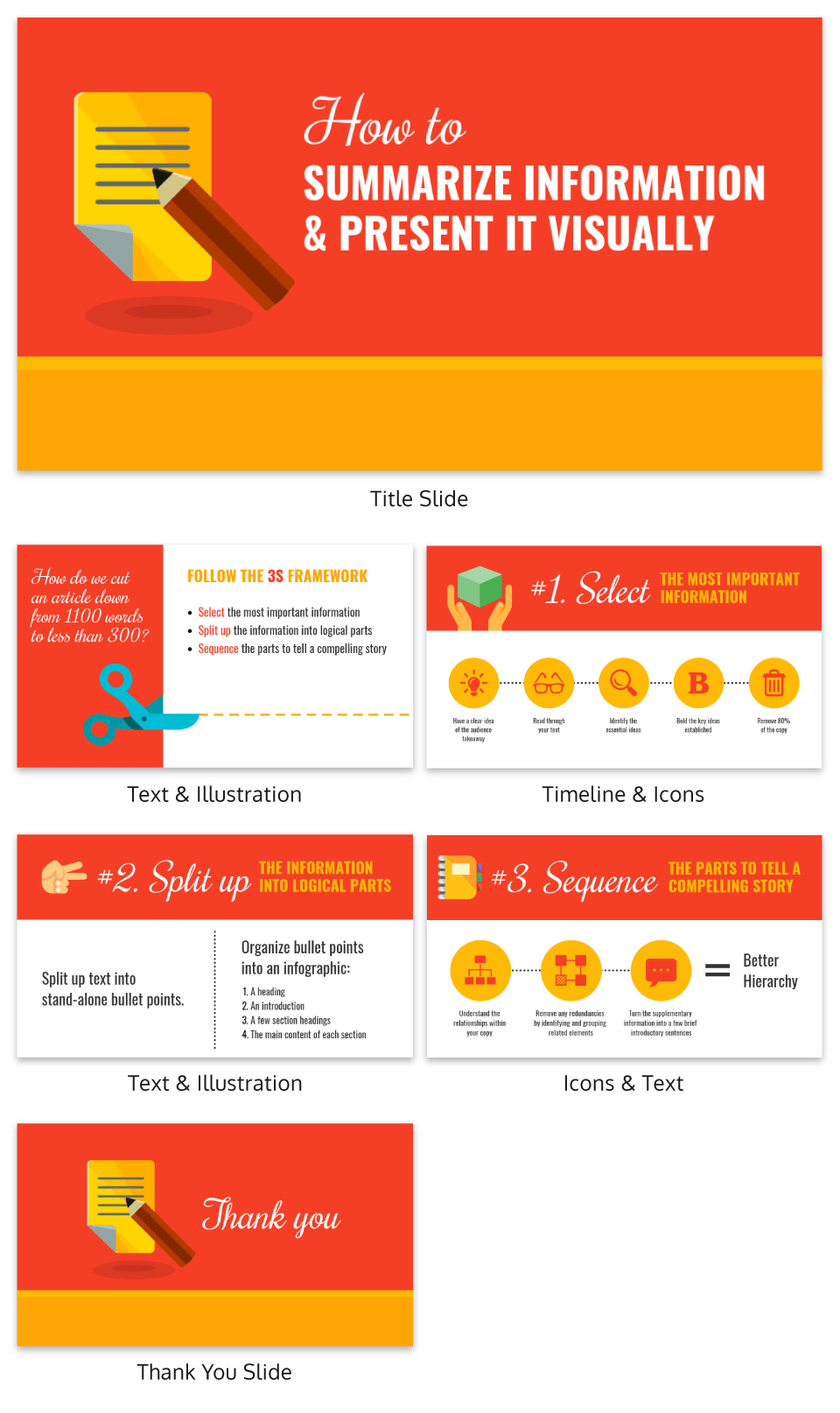
What I really love about the presentation example above is that it features a catchy tagline on the second slide–“The 3S Framework.” It’s simple but it works!
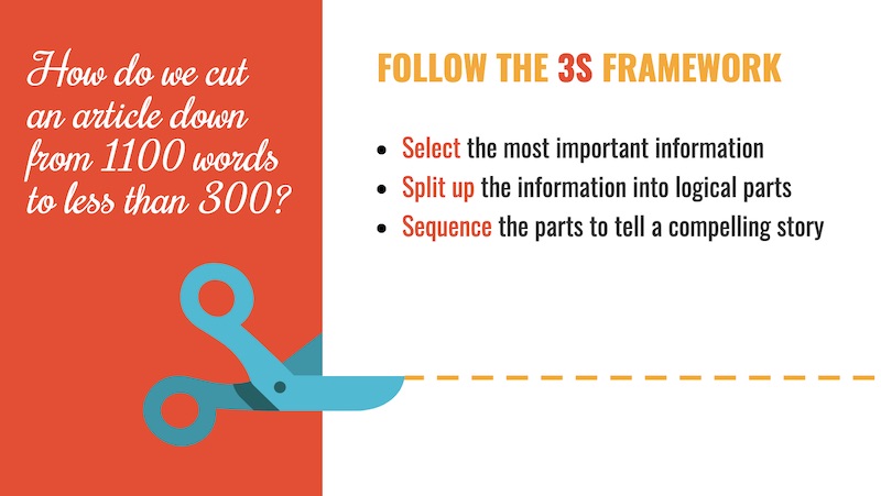
This motto helps outline the structure of the presentation, and each slide referring back to it. Plus, the tagline will give the audience something to latch onto and remember from the presentation.
84. White backgrounds are not always bad

A lot of people think that plain white background is a boring presentation faux pas. So the first thing they do is add color or image, which is not a bad thing at all.

But I also think that when used correctly, like in this example, plain white backgrounds can lead to beautiful presentations.
85. Split the header text from the body text
This idea is very similar to the one-two punch tactic that I talked about above, but it spreads the content over two slides as opposed to a single slide.
Use this design choice when you have fairly easy to follow presentations, like the one below from Steve Young. I know that this is effective because it allows the audience to focus on the main point before he drives it home with the supporting details.
86. Feature circle image frames

I am a big fan of the design choices that Frank Delmelle uses in this slide deck about content strategy. He uses circles as his main design motif and frames his images in circles as well.
87. Talk directly to your audience

This slideshow tops out at 70 slides but it’s a breeze to flip through. That’s because the creator, Ian Lurie, decided to present it in the form of a conversation instead of a classic slide deck.
While each slide only has one or two sentences, it flows just like a friendly chat. He also includes the necessary pauses, breaks and other conversational tics that helps make it even more convincing.
88. Illustrated icons are key this year
Icons add a fun and functional element to your designs. In this presentation by Iryna Nezhynska, they use illustrated icons to make a potentially intimidating topic seem manageable.
89. Highlight key numbers and percentages
Surprising percentages have the ability to excite and shock an audience. To make the percentages on your slides even more impactful, present them in a different color or font than the rest of the text.

In the presentation example above, Contently uses that exact tactic to bring more attention to key numbers.
90. Use a gradient as your presentation background
Just like bold color schemes, gradients are a current social media graphic design trend. They may feel retro to some, but I believe they will be around well into the future.
Gradients are perfect for presentation backgrounds because they are so versatile and eye-catching. I mean, you can literally create a gradient with any colors you can think of! And they look a lot more interesting than a simple flat background.
So embrace the future and use a gradient in your next presentation!
91. Track the steps in a process
In this example, the creators from O.C. Tanner add a very interesting feature to their slides, starting on slide number 6. If you take a look at this business presentation template, you will see that they number the steps in a process and track which step they’re on at the bottom of the slides.
92. Use mind blowing font pairings
The creator of this slide deck uses at least 10 different types of fonts. And it looks fantastic because they know that one font choice is boring. But this does not mean that you should use a bunch of random fonts–pick font pairs that play well together and keep your font choices for different types of information consistent throughout the presentation.
93. Make your ideas as obvious as possible
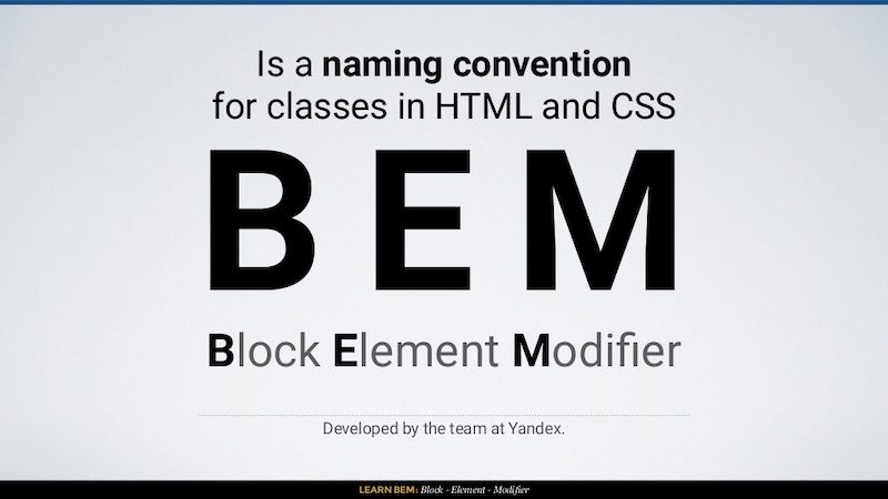
Your audience shouldn’t be guessing at what you mean. That is why I think that this presentation example from In a Rocket is so powerful because they make the information easy to digest.
Learning to code can be challenging, but they break the information down with simple diagrams and clear examples. Heck, I have not touched CSS in a few years and I could still follow what they were instructing.
94. Use images that will actually scale

A large mistake that you can make in your slide deck is using low-quality images. They may look great on your computer, but as soon as the slides are put up on a screen, the low quality will show. In this example by ThoughtWorks, all of their presentation background images look great and will scale well to a bigger screen. And that is even after the image compression that LinkedIn most likely does!
95. Take risks with your presentation layout

I honestly was blown away the first time I saw this presentation because it capitalized on such a risky design idea. The creators from Weekdone literally turned their presentation into an 8-Bit video game. And if you are looking for something that will stick with your audience, I would take a few creative cues from them!
96. Seriously, you better use memes

In this day and age memes are mainstream, so why wouldn’t you use them in a creative presentation? These do not have to be the coolest meme that all the hip kids are sharing, they can be some of the classics. Like the one that Dana DiTomaso uses on slide 16 to emphasize that it’s a trap!
97. Follow a clear design rhythm
I really like how this presentation introduced each new point in three or four steps, using the same design. It gave the presentation a rhythm that flowed almost like a song!
I would recommend using this approach if you have to introduce multiple points per slide.
98. Use LOTS of icons

If you have made it this far in the list you have already probably seen how effective icons are in presentations. They are the perfect way to support your ideas and make your presentation more pleasing to the eyes.
For example, take a look at all the icons SlideShop uses in this presentation. Almost every slide has at least one icon and a few have more than ten!
99. Give each slide its own spark

I know this goes against earlier points I had about creating a cohesive theme in your presentation layout, but everyone knows that rules are made to be broken (if you can do it better)!
In this slide deck, the team at Officevibe literally created different designs for all 27 of their slides. And to top it off, each of the designs fit the quotes they used extremely well.
100. Use LARGE header cards

An easy way to stick to that “one piece of content on each slide rule” is to use header cards. They are basically the header that you would normally use in a blog post or article, but it gets is own slide before the content. Here is an example of that idea in the real world in this presentation from Brian Downard.
101. Ask your audience questions
I think one of the most common elements I saw in all the slide decks was that they asked the audience questions. You can use questions to engage with your audience and get them thinking a bit harder about the topic. The Site By Norex team did an exceptional job of this when they explored what the topic of what makes up a brand.
Need some more info about creating a memorable brand? Check out some of the best branding stats for 2020 and beyond!
102. Introduce yourself and your brand
I would say that a majority of presentations that I looked at in this list just jumped right into the content without an introduction to the author or brand in the actual slide deck.
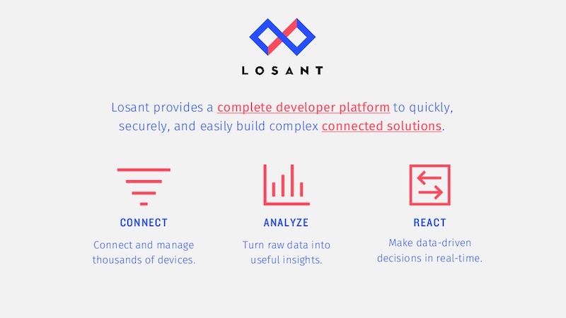
This introduction is very important because it establishes your credentials from the beginning, especially if someone is just reading the slide deck. In this example from Losant, they do just that by spending the first few slides telling the audience who they are.
103. Mix up your mediums
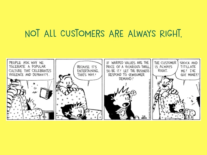
Finally, this slide deck effectively marries two very distinct content forms together: digital images and hand-drawn illustrations. In this example, Freshdesk uses the timeless classic of a comic strip, Calvin & Hobbes, in something so modern to inform the audience in a fun way.
104. Show off your credentials
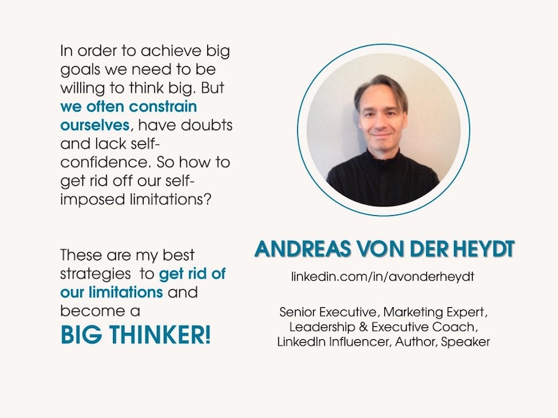
Just like with any piece of content, people are more likely to believe what you are saying if they know what your company does. That is why I really like when people insert their qualifications right into the presentation slides. Just like Andreas von der Heydt, from Amazon, did at the beginning of this presentation about thinking big.
105. Highlight key data points
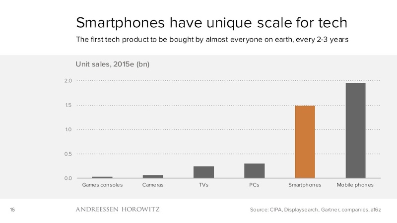
If you are presenting a chart or graph on a dry topic, I would recommend using a single color to highlight the most important data point. For example, the investment firm a16z uses orange to highlight the data points they want their audience to focus on in each of their charts.
Check out some examples of how to highlight your key information in bar charts.
106. Show your audience where to find more information

A lot of people end their presentations by literally just running out of slides, and that is the wrong way to do it. Instead, CBInsights consistently pushes their readers towards another piece of content at the end. This is also where you can insert a call to action!
107. Tell your origin story

This idea is kinda similar to showing off your company qualifications at the beginning of your presentation. But with this approach, you are trying to make an emotional connection with your audience instead of just showing off accolades.

And Rand from Moz does this extremely well in the presentation example above.
108. Use one focused visual

This presentation uses a central visual of a structure, with each slide moving down the levels of the structure. This is incredibly powerful because the entire presentation is about sinking your company, and the visual they designed mirrors that idea perfectly. Using one focus visual also makes your slide deck design cohesive.
109. Don’t take presentation design too seriously

Sometimes we get caught up trying to make the perfect presentation and it ends up making us crazy!

But in this presentation example, Jesse Desjardins uses a mix of wit and hilarious retro images to create a memorable and light-hearted presentation.
110. Use size to your advantage
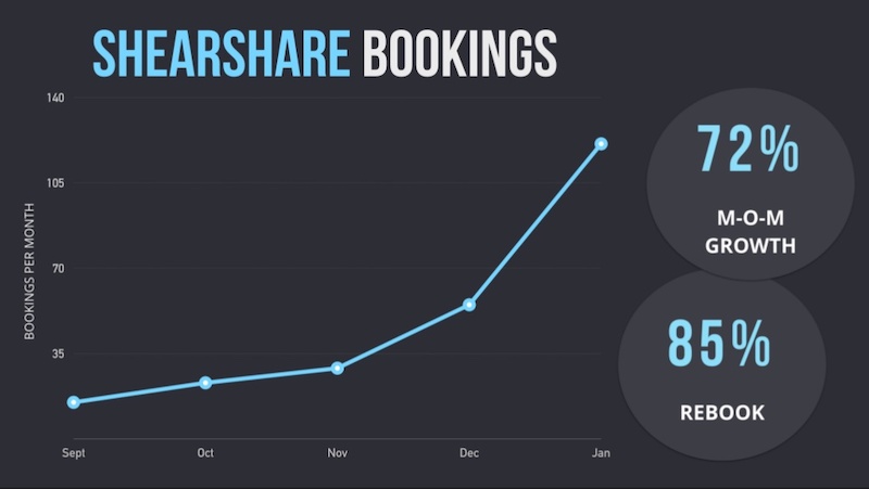
I am a big fan of using bubble charts and other charts that use size to compare two pieces of data. That is why I like this pitch deck from the ShearShare team that utilizes a size-based chart on slide number 9. The chart is used to illustrate the massive growth potential in their industry.
111. Split section headers from the main content with different background colors
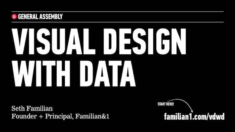
In this presentation, Seth Familian uses alternating colors in a very interesting way. For each of the title slides, he uses a black color background, but for the content slides he uses a white background.
This helped the readers follow along and comprehend what was on the page even faster. And when you are presenting to hundreds of different types of people, this can make or break your presentation.
112. Have a conversation with your audience
Take a conversational tone in your presentation is a great way to encourage your audience to participate.
In this slide deck example, we presented a simple storyline and use questions to engage with the audience throughout. And it helped create a flow throughout the presentation template that is easy to follow.
113. Include your branding throughout your presentation ideas

Another thing that people seem to forget when they are working on a presentation is to include their business’s branding. You honestly never know where your work is going to be shared, so it is important to make sure people know it’s yours. HubSpot does an outstanding job of this on all their presentations, as you can see in the bottom left corner of each slide.
Plus you have spent a ton of time creating your brand guidelines, might as well use them.
114. Include multiple slides to build to your main point
Try using multiple slides to build to your main point. This helps you walk through the components of one overarching point while also building suspense. In this slide deck, the creator uses 6 slides to build up to one main point, adding a new illustration to the diagram on each slide.
115. Split the difference
Use either the left or right side of the slide to hold your text and the opposite to display an image. If you are using a photo or graphic as the main background in your slides, this is a great way to keep things organized.
116. There are millions of fonts out there…use them
Hey, I love simple fonts just as much as the next guy, but sometimes you need to step up your font game to stand out. For example, WebVisions uses a very gritty, probably custom font in their unique presentation that fits the topic extremely well. Take a look!
117. Build your presentation content around icons
Try using icons as the focal points of your presentation layout. This example from Omer Hameed uses icons to draw the audience’s eyes right to the middle of the presentation, where the main points and headers are located.
118. Mix up font style to emphasize important points
If you would like to draw some extra attention to a certain word or idea, switch up the font to one that is bolder. For example, in this oldie but goodie presentation from HubSpot they use a heavy sans-serif font to highlight ideas, as opposed to the serif font for the other text.
119. Add personal touches to your presentation

If you want to create a truly unique presentation, add personal touches. In the slide numbers 6-13 from this presentation, the creator adds something to their design that no one else could ever have: they use original drawings they did themselves.
120. Harness the power of your own brand colors

Sometimes people forget that they already have a battle-tested color palette that they can use in their brand colors. I try to incorporate one of our brand colors in most of my designs and it makes so much easier to choose colors.
In this simple presentation example, Spitfire Creative used a palette that had both of their brand colors throughout the slideshow.
121. Used dark-colored blocks to highlight words
I have seen this trick used in a lot of presentations and it works well. Highlight certain words or phrases by laying them overtop a colored rectangle. Take slide number 7 in this presentation example as a great guide. Use it to bring attention to a saying or idea you really want your audience to remember.
122. Show the audience your mug
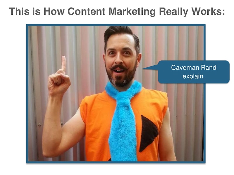
This presentation example comes from the same presentation as a previous one, but it was too good not to share. Throughout the slides, you will see Rand from Moz pop up to add a human element to the design. Using an image of your team or yourself can put the audience at ease and make it easier to connect with the presenter.
123. Include a helpful table of contents
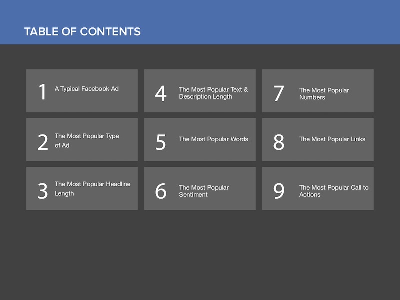
I only saw this presentation idea used a few times throughout my research, but I believe it should be used a lot more. A table of contents will help the audience know what to expect and keep their focus throughout. Especially if you are creating a presentation that is a bit longer than normal.
124. Do not post just screenshots, do more
Screenshots of a program or app are very common in any blog post, but I think you can do a little better when it comes to presentations.
So instead of just posting a boring screenshot, add a little more to the slide by using illustrations and product shots. If you are not sure what I am talking about, just check out how great the screenshots look at slide numbers 7 and 8 in this presentation.
125. Highlight keywords using BOLD color
Here’s another slide deck that uses different colors and blocks to highlight keywords. If you are going to use text-heavy slides, then make sure the key points are easy to pick out. Take this slide deck: starting in slide number 4, they highlight exactly what they want you to take away from the text on each slide!
Enough presentation ideas for you?
You made it! I applaud you for making it through all those presentations. Hopefully, now you have a few nifty presentation ideas ready for when you need them.
The next step is to create a presentation that will captivate a meeting room, an amphitheater, and even the world (hey, it doesn’t hurt to dream big).