


Infographics are content assets that convey information in a visual way. While visualizing your content has multiple benefits – from making information easier to grasp and remember to encouraging people to share that information, infographics can also make content inaccessible.
Where infographics can lack is in making the visualized information accessible to all, i.e. people with visual disabilities.
Therefore, infographic designers must include accessibility factors into their design process to ensure the content is:
- Easy to see for people with visual difficulties, such as color blindness
- Recognizable to screen readers
- Possible to understand to people with cognitive disabilities
In the meantime, let’s dive in to see how you can apply accessible design in creating infographics with Venngage.
The concept of inclusive visual design
More than 60 million Americans, are reported to have a disability of some kind.
That’s more than a quarter of US population which far too many of web users for graphic designers to ignore.

As Shir Ekerling, CEO of accessiBe, an AI-based start-up offering an automatic web accessibility solution, put it,
“The number of disabled users who are cut off from using the Internet fully is enormous. They are far too many to dismiss as marginal and irrelevant.”
This is where the concept of inclusive visual design comes into play including as many people’s needs and abilities as possible.
If you are planning to create a lot of infographics, consider creating a new project to curate them. This will open up more marketing, lead generation and link-building opportunities. This business name generator will help you find a cool affordable .fun or .tech domain.
Related: 8 Best Practices for Designing for Diversity and Inclusion
How to design and accessible image infographic using Venngage
When it comes to infographic design, consider both color blindness and low vision should be taken into account.
Make sure your infographic is clear and easy to understand. People with low vision should have no difficulty reading and understanding it.
Practically, this means:
- Making sure to provide good contrast
- Ensuring your font size is large enough

Understanding Accessible Color Contrast
When designing your infographic, you can use an accessible design tool to run some contrast-checking and accessibility testing to ensure your designs comply with all accessibility guidelines, therefore pass Web Content Accessibility Guidelines (WCAG) requirements. This will ensure your infographic is easy to read for people with poor vision.

Once you have selected your colors, you can view the color combination in grayscale to identify how the colors appear to a colorblind user:

Pro Tip: To find your color RGB hexadecimal format inside your infographic editor, select that area and click “color” icon on top:

From there you can adjust the color until you find a more suitable background color using the contrast checker.
It is also recommended to avoid using shades of gray, yellow, and orange.
You can also upload your whole infographic to see whether your colors pass the requirements:

Here is a cheat sheet for picking color blind friendly palettes:

If color contrast is still a little too dense for you, you can always use our Free Color Blind Simulator; the tool lets you experience what it’s like to have red/green, blue/yellow, or complete color blindness. Just add the link to the color vision simulator and try out the different filters there.
For more tips on color blind design guidelines, check out this post: Color Blind Design Guidelines: How to Convey Meaning to Everyone [With Examples & Templates]
For more on the topic of accessible design, check out this post: ADA Standards for Accessible Design: How to Be Compliant
Choosing an Appropriate Font Size
When you have to visualize a lot of information within one image, it is very tempting to use tiny font to be able to say more.
Unfortunately, this goes against inclusive visual design principle making your infographic hard to read for partially sighted users.
WCAG 2.0 requires a text font no less than 10 points (which is about 13 pixels) for it to be accessible. Smashing Magazine suggests sticking to 16px fonts.
Additionally, it is recommended to avoid “fancy” fonts as it may pose some issues to people with cognitive disabilities. The best practice is to use “standard” fonts, avoiding cursive and fantasy fonts.
- One of the most accessible fonts is Arial; other good options are Calibri, Helvetica, Verdana, and Tahoma
- Try to use no more than 2 types of fonts
- Again, make sure there is a good color contrast between the text and the background (use the color contrast checker above).
Pro Tip: Generally, Venngage’s infographic templates offer readable fonts by default but you can always change the font by selecting the text and clicking through available options:
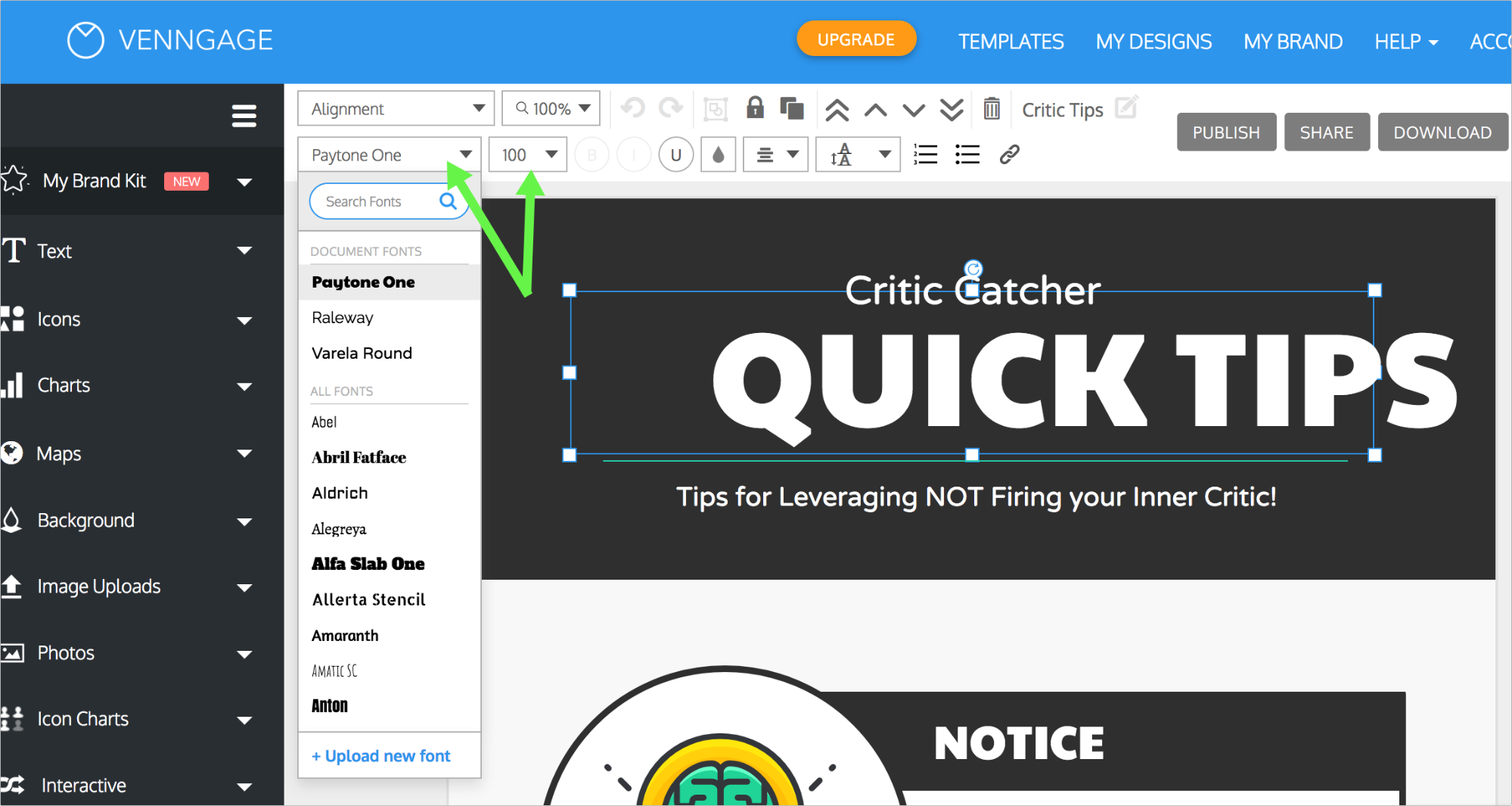
[You can also change the font size using the drop-down next to the font]
Create a detailed transcript
More than 7,2 million of adults (ages 16 to 75+) were reported to have a visual disability in the United States in 2016.
It was also estimated that over 90% of the visually impaired use screen readers. Screen readers work by translating textual content to either voice or braille.
Therefore it is important to provide a detailed text transcript for your infographic:
Make Your Transcript Easy to Find
- Always make it clear where the transcript can be located by using headings like “Text Alternative” or “Text Version”.
- Use “Skip Navigation” links to make your graphic transcript easy to locate. The “Skip Navigation” concept was invented to let screen reader users go directly to the text version of the infographic. You can use this detailed tutorial on how to add anchor links to create accessible “Skip Navigation” for your infographic page.
Related: Image Alt Text: Definition and Best Practices for Accessible Designs
Structure Your Transcript Using HTML Subheadings
Within your transcript make sure to use H2/H3 subheadings to ensure your content structure is easy to understand (when listening to it).
Screen reader users should be able to scan the page by headings and understand each section. This helps screen reader users to navigate through your transcript easily and come back to any section they want to listen to again.
One of the best ways to structure your content well is to use Text Optimizer’s Content Ideas section. It generates the most popular questions on each topic, so you can use the suggestions as the base structure of your content.

Using question research for content structuring makes content much easier to understand and more interesting to read (or listen to).
You can also select an accessible theme which would have many of user experience elements (including “Skip Navigation”, breadcrumb navigation, clear site structure, etc.) already in place.
Test Your Transcript for Clarity
Use Text-to-Speech tools to simulate screen reader user experience and make sure your transcript is clear enough when it is being read to you.
Provide an Alternative File Format
Finally, offering alternative file formats is always a good idea. It includes all kinds of audience into your content marketing strategy.
For example, you can download your infographic as a PDF file and offer it as a free download. People with poor Internet connection or those using PDF files for printing will be thankful. You can download Venngage infographics as PDF files.
Additionally, you can turn your infographic into a video and let people with hearing or attention difficulties watch a more entertaining version.
Conclusion
In many ways, creating an accessible infographic means making your infographic easy to read and understand which also helps make it more useful. On the other hand, providing a detailed transcript will make your infographic page SEO-friendlier.
That being said, following the steps above, you will achieve more goals, beyond catering to people with various disabilities. Specifically, you will ensure your infographic search discoverability and make it more engaging. Good luck!
Want to learn more about accessible design?
More infographic design guides:
How to Make an Infographic in 5 Steps
How to Use Color Blind Friendly Palettes to Make Your Charts Accessible
How to Pick Colors to Captivate Readers and Communicate Effectively